Physical Address
304 North Cardinal St.
Dorchester Center, MA 02124
Physical Address
304 North Cardinal St.
Dorchester Center, MA 02124

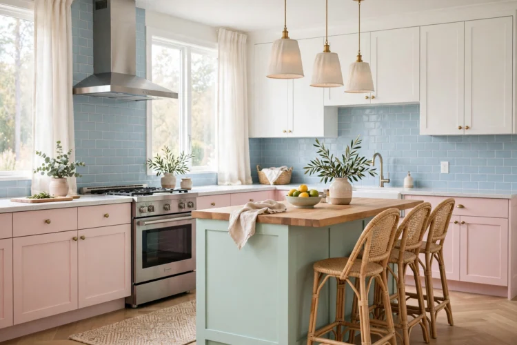
Pastel kitchens stay sophisticated when one soft color anchors the room and wood, black, or chrome does the balancing. These nine ideas show the formula.
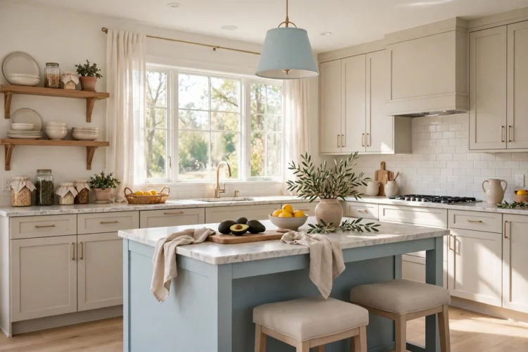
Pastel kitchens get a bad reputation because most of them use too much pastel at once. Blush walls, mint cabinets, and a blue floor in one room will always look like a nursery. These pastel kitchen ideas work differently. Each one uses a single pastel anchor, then balances it with wood, black, or chrome so the room stays sophisticated. The result is a kitchen that feels light and calm without feeling young.
The rule for pastel is simple: one pastel anchor per room. Pick the cabinets, the backsplash, the island, or one painted wall, and keep everything else neutral. When the pastel appears in one place, it reads as a deliberate color choice. When it appears in five places, it reads as a theme. The anchor should be the largest pastel surface in the room, so the eye knows where the color lives.
Choose your pastel by the light in the room. North-facing kitchens suit warmer pastels like blush and butter, because cool light can make mint and powder blue look gray. South-facing kitchens can handle cooler pastels because the warm sun balances them. Paint a large sample board and check it at breakfast, at noon, and at dinner before you commit.
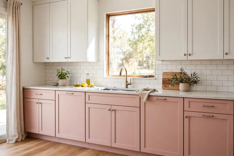
Blush pink lower cabinets feel warm and grown-up when the rest of the room stays quiet. The pink should lean warm, like a dusty rose, rather than bright or bubblegum. Pair blush lowers with white uppers or open wood shelves, and use a pale stone counter so the pink has room to breathe. Black or bronze hardware keeps the look from drifting toward sweet, while chrome pushes it cleaner and more modern.
Blush works best in kitchens with warm wood floors or a wood island, because the wood echoes the warmth in the pink. A blush kitchen with a gray floor can look washed out, so keep the floor warm if you choose this color. The payoff is a kitchen that feels soft in the morning light and still looks serious enough for a dinner party.
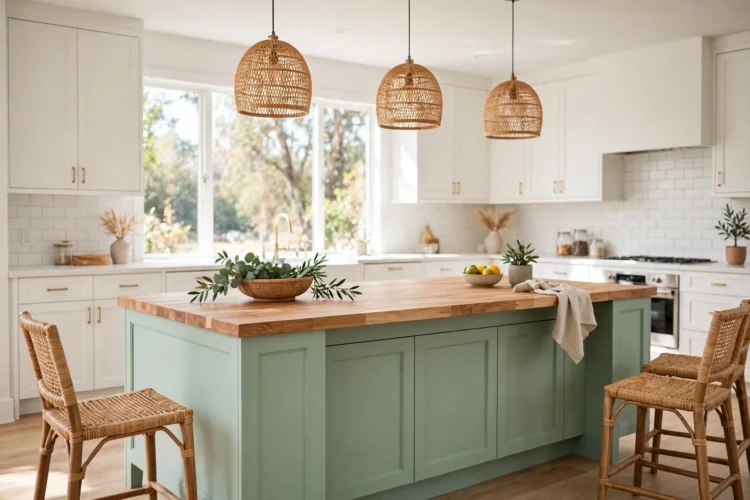
A mint green island is the safest pastel move in a kitchen. The island is one piece of furniture, so the color stays contained, and it gives the room a focal point without repainting a whole cabinet run. Mint pairs well with white cabinets, a butcher block top, and brass or black hardware. The green reads as fresh rather than sweet when the wood around it is warm and the metal is matte.
Keep the mint soft and slightly gray rather than bright. A bright mint can look like toothpaste under strong light, while a dusty mint holds its color through the day. If the island has seating, repeat the mint once in a small way, such as a cushion or a vase, so the color feels connected to the rest of the room.
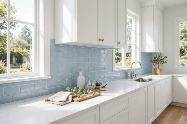
A powder blue backsplash adds color exactly where the eye rests while you cook, and it costs far less than repainting cabinets. Glossy subway tile in powder blue reflects light and makes a small kitchen feel brighter, while a matte finish feels calmer and more modern. Pair the blue with white cabinets and a pale counter so the tile is the only color in the room.
Powder blue works with both warm and cool hardware, which makes it flexible. Brass warms it up, chrome keeps it crisp, and black gives it a graphic edge. For more color inspiration at the cabinet level, see these blue kitchen ideas from powder to deep navy, which show how the same family of blue behaves across a whole room.
Black hardware is the fastest way to make a pastel kitchen feel adult. Matte black pulls, knobs, and a black faucet add a sharp edge that stops blush or mint from looking soft all over. The contrast works because black is a strong neutral, not another color competing for attention. Use it on the cabinets, the faucet, and one light fixture so it reads as a system rather than a single dark detail.
Keep the black matte rather than glossy, since glossy black can look harsh against a soft pastel. A black faucet also hides water spots better than chrome, which is a practical bonus in a kitchen that gets used daily. If black feels too strong, oil-rubbed bronze gives a similar grounding effect with a warmer tone.
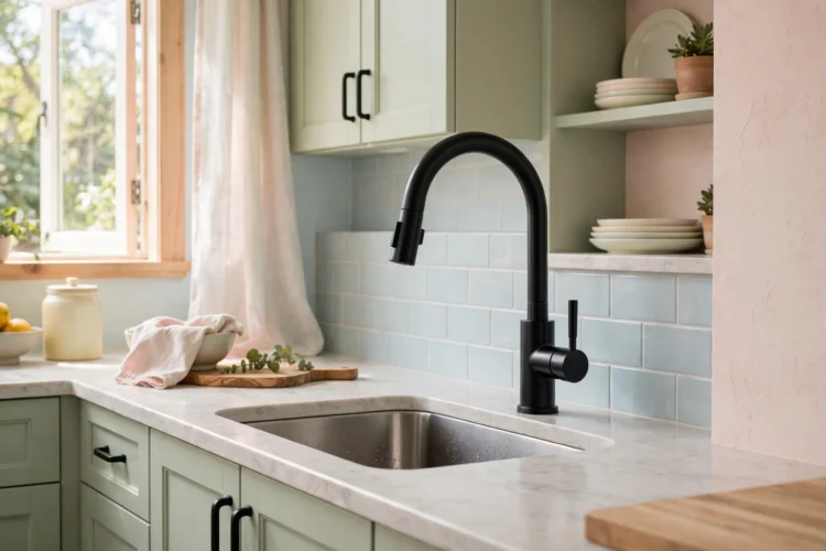
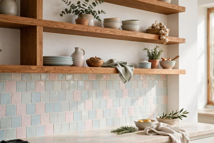
Wood is the ingredient that keeps pastel kitchens from feeling cold or flat. A wood floor, a butcher block counter, or open wood shelves add warmth and grain that soft pastels cannot provide on their own. The wood tone matters: honey oak and walnut warm up blush and mint, while pale ash keeps powder blue feeling fresh. Avoid gray-washed wood with pastel, since the two cool tones together can make the room feel washed out.
One wood surface is usually enough. A wood island top with painted cabinets, or wood shelves above a pastel backsplash, gives the room its warm anchor. For ideas on mixing painted and wood cabinets in one room, see these two-tone kitchen cabinet ideas for a custom look.
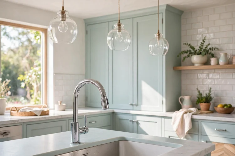
Chrome and glass keep a pastel kitchen crisp by adding reflection. A chrome faucet, glass pendant shades, and a glass-front cabinet or two bounce light around the room and stop the soft colors from going dull. This matters most in kitchens with little natural light, where pastel can turn gray without enough shine in the room. Glass also breaks up large painted surfaces without adding another color.
Use chrome sparingly and keep it polished. A few bright pieces, such as the faucet and the cabinet pulls, are enough. Too much chrome can feel cold, so balance it with the wood from the previous idea. New hardware is one of the cheapest updates in a kitchen, and these kitchen cabinet hardware ideas show how a small swap changes the whole room.
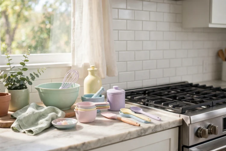
If painting cabinets feels like too much, put the pastel in the details instead. A mint stand mixer, blush linen towels, a powder blue kettle, or a row of pastel canisters gives you the color without a single permanent change. This approach suits renters and anyone who likes to change colors with the seasons, because the details move and the room stays neutral underneath.
Group pastel details in one zone, such as the counter near the stove or the open shelf by the window, so they read as a collection rather than random colored objects scattered around the room. For a soft cabinet color that pairs well with pastel details, see these cream kitchen cabinet ideas for a softer take on white.
Pick one pastel, give it one strong partner, and let the rest of the room stay quiet. That is the whole formula. Test the color in your own light first, since pastel shifts more than most colors between morning and evening, and a sample board costs far less than a repaint.