Physical Address
304 North Cardinal St.
Dorchester Center, MA 02124
Physical Address
304 North Cardinal St.
Dorchester Center, MA 02124

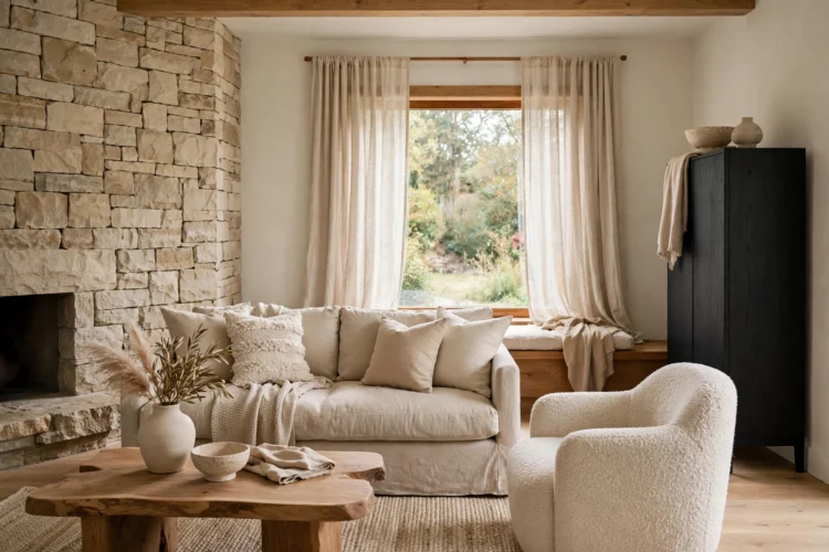
Neutral rooms feel boring only when they lack contrast and texture. These 11 ideas keep beige, greige, and cream spaces warm, layered, and interesting.
Neutral home decor ideas get a bad reputation. People picture a beige room with nothing to look at, a space that photographs well and feels like nothing in person. The problem is not the palette. It is the lack of contrast, texture, and one strong focal point. A neutral room works when the eye has somewhere to land and something to touch, even if every color in the room sits within a few shades of cream. The eleven ideas below keep beige, greige, and cream rooms interesting without adding a loud accent wall or a color you will regret in a year. Each one costs little, works in rentals and owned homes alike, and builds on what you already have.
Every calm neutral room needs one dark note. Without it, beige on beige on cream turns into a fog where nothing stands out. The anchor can be a charcoal sofa, a black-framed mirror, a walnut coffee table, or a deep bronze floor lamp. It does not need to be large. It needs to be dark enough to give the eye a place to rest.
Pick one anchor per room and repeat its tone once or twice in small doses, such as a black picture frame or a dark woven basket. The rest of the room can stay pale. That single contrast makes the light colors read as intentional instead of unfinished, and it keeps the room from feeling washed out on a cloudy day.
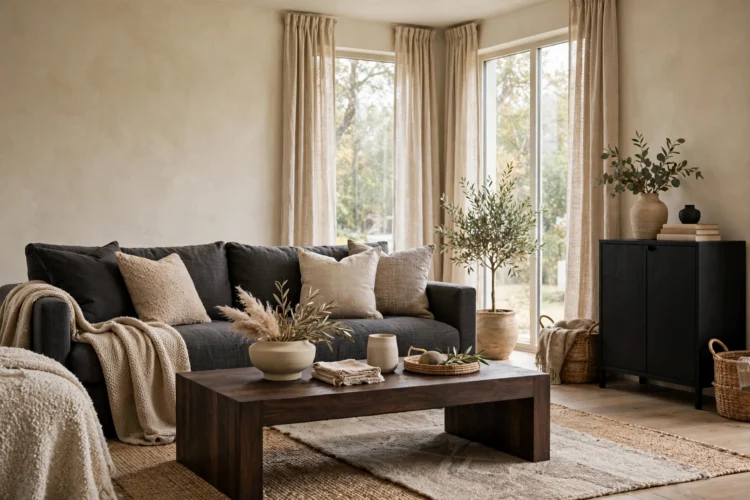
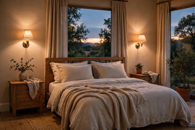
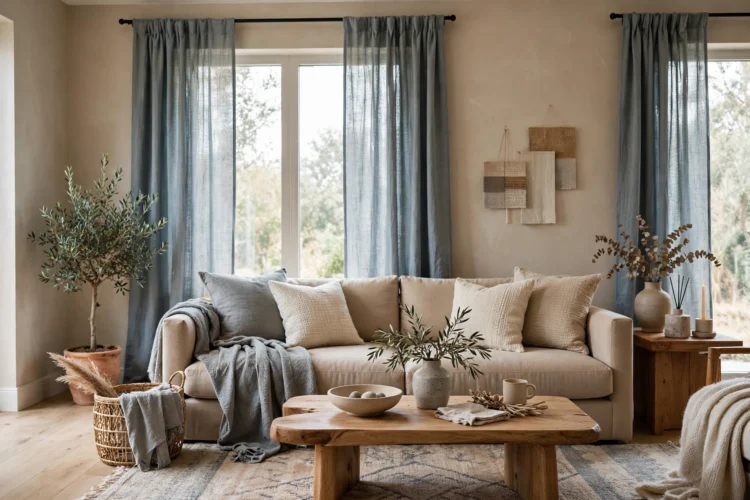
A room full of only warm beiges can look muddy, and a room full of only cool grays can feel cold. The fix is to mix both on purpose. Pair a warm greige wall with cool linen curtains, or set a warm oak side table next to a cool stone vase. The tension between warm and cool keeps the palette awake.
Start with a base that leans one way, then add two or three pieces from the other side. If your walls are warm cream, try a cool gray throw and a silver-toned tray. A calm color palette still works when it holds both temperatures, as long as one of them clearly leads and the other one supports it.
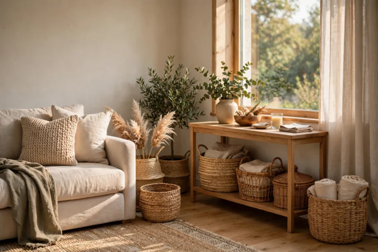
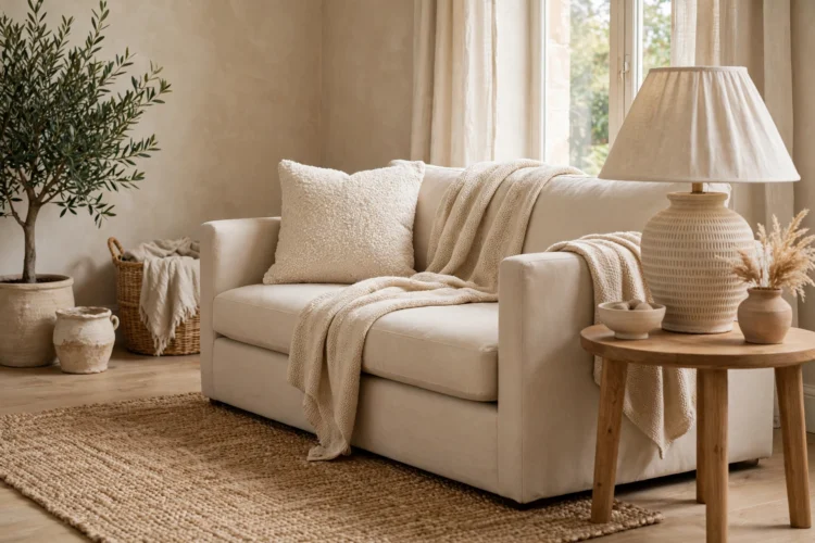
Texture is what makes a neutral room feel rich instead of flat. Aim for at least three textures in every seating area: something soft, something rough, and something smooth. A bouclé cushion, a woven jute rug, and a polished ceramic lamp cover all three in one corner.
Work through the room and touch each surface in your mind. Smooth leather next to nubby wool, matte plaster next to brushed brass, rough linen next to glossy wood. Textile layering does most of the work here: a rug under a throw under a cushion builds depth that color alone cannot. When the textures are right, the room feels finished even before you add a single colored object.
Small decor gets lost in a neutral room because nothing grabs attention. One oversized piece fixes that. A large floor mirror, an extra-wide piece of art, or a tall vase with branches gives the room a clear focal point and makes the rest of the furniture look considered rather than scattered.
Hang the large piece where you look first when you enter the room, usually above the sofa or across from the door. Keep the wall around it mostly bare so the piece can do its job. A big mirror also pulls in light from the window, which is useful in a pale room that can go dim in the afternoon. Good mirror placement doubles the daylight and doubles the sense of space at the same time.
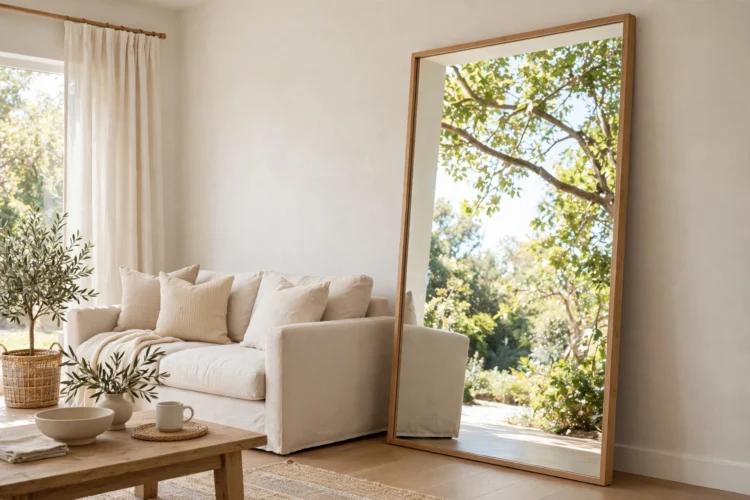
White trim against a beige wall draws a hard line around every door and window, and that line chops a neutral room into pieces. Painting the trim, doors, and walls the same color erases those lines. The room reads as one continuous surface, which makes it feel larger and calmer.
Use the same paint color in a different sheen for the trim, such as eggshell on the walls and satin on the baseboards, so the surfaces still read as separate up close. This trick works best in rooms with lots of molding or built-ins, where white trim would otherwise create a grid of outlines. It costs one extra gallon of paint and changes the whole room.
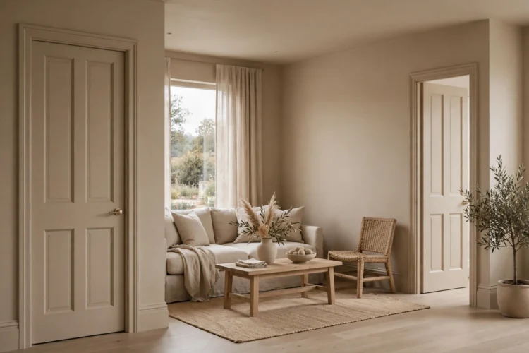
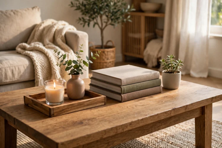
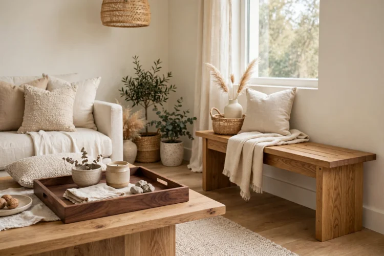
Wood is the easiest warm material to add to a neutral room because it brings grain, tone, and age all at once. A walnut tray on a pale ottoman, an oak bench by the door, or a teak bowl on a cream sideboard breaks up the flatness without adding color. The grain itself becomes the pattern.
Mix two wood tones at most so the room stays calm. A medium oak floor with a darker walnut accent works; four different wood finishes in one room starts to look accidental. Let the wood show its grain instead of painting over it, and keep the pieces simple so the material stays the star.
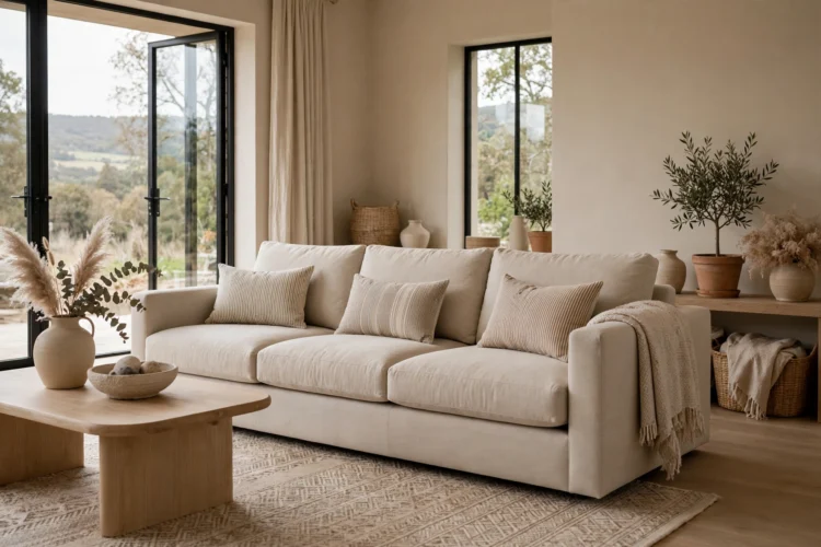
Neutral rooms do not need to be pattern-free. They need pattern at a scale that does not fight the calm. Small checks, thin stripes, tiny geometrics, and subtle tone-on-tone prints add movement without shouting. A cushion in a small-scale stripe or a rug with a faint diamond weave gives the eye something to follow.
Keep the pattern in the same color family as the room so it reads as texture from a distance. Two patterned pieces per room is enough; a third one should be a plain solid to give the eye a rest. Try throw pillow combinations that pair one small pattern with one solid and one texture, and the sofa will look styled instead of staged.
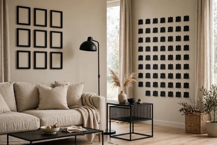
Black is the punctuation mark of a neutral room. A black lamp base, black frames, black cabinet pulls, or a black metal side table gives the eye a sharp edge to hold on to. The key is repetition: one black object looks like a mistake, but three small black notes spread across the room look like a decision.
Keep each black accent small and useful, not decorative for its own sake. A black tray on the coffee table, a black floor lamp by the reading chair, and black-framed art above the sofa form a triangle that pulls the room together. Matte black reads softer than gloss black and suits a calm palette better.
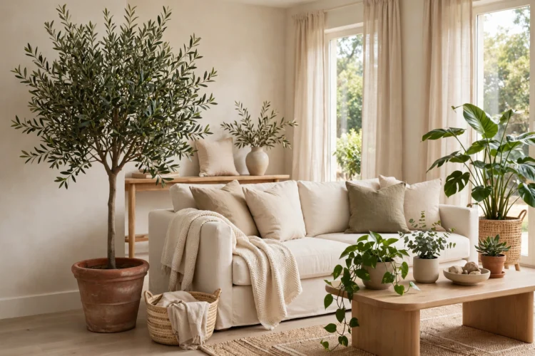
Green is the one color that never clashes with a neutral palette, and plants bring it in without paint or fabric. A tall olive tree in the corner, a trailing pothos on a shelf, or a small fern on the windowsill adds life and a soft shape that breaks up straight lines. Plants also change with the seasons, so the room never looks frozen.
Choose two or three plants of different heights and put the tallest one where the room feels empty. Water them on a set day so they stay healthy, and wipe the leaves once a month so they keep their shine. A struggling plant draws more attention than no plant at all, so pick varieties that match the light you actually have.
The planter matters as much as the plant. Terracotta, matte ceramic, stone, and woven baskets all sit happily in a neutral room, while a bright plastic pot fights the whole scheme. Pick planters in cream, sand, charcoal, or natural fiber and repeat one material twice so the plants feel like part of the decor instead of an afterthought.
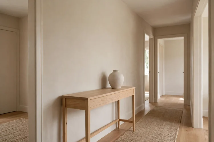
A neutral room loses its calm the moment every surface holds something. Pick one surface, the coffee table, the console by the door, or the top of a dresser, and keep it completely clear except for one object. That empty space is what makes the rest of the room feel curated instead of crowded.
The clear surface gives the eye a place to rest and makes the styled surfaces around it look deliberate. It also makes the room easier to clean and easier to reset at the end of the day. If the clear spot keeps collecting clutter, move the catch-all basket to a closed cabinet so the surface stays honest.