Physical Address
304 North Cardinal St.
Dorchester Center, MA 02124
Physical Address
304 North Cardinal St.
Dorchester Center, MA 02124

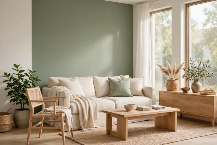
Nine whole-home color palettes built on a dominant neutral, a supporting tone, and one accent, shown room to room so your home feels calm and connected.
A calm home is rarely an accident. It comes from a color palette that repeats from room to room, so the eye never gets a shock when you walk through a doorway. Home color palette ideas work best when each one has a clear structure: one dominant neutral, one supporting tone, and one accent that shows up in small doses. These 9 color palette ideas for calm cohesive homes follow that structure, and each one works across the whole house.
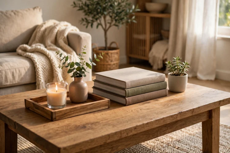
Before you pick paint, test the palette with fabric and objects you already own. Hold a pillow, a throw, and a book against the wall in daylight and in lamplight. Colors shift between morning and evening, and a palette that looks calm at noon can look muddy at night. Test first, paint second.
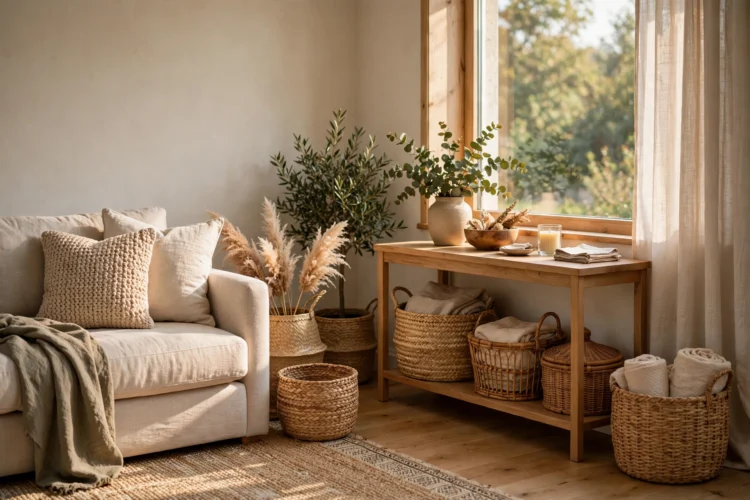
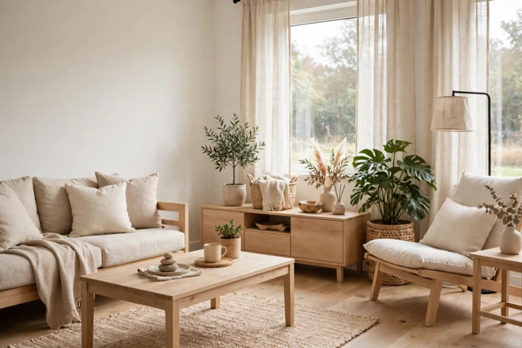
Warm white walls plus one wood tone is the simplest calm palette there is. The white keeps rooms bright. The wood, in oak, walnut, or pale ash, stops the white from feeling cold. Add linen in a natural tone and a single green plant, and the room is done. This palette suits small homes especially well because it makes rooms feel larger without feeling empty.
Avoid bright white on every wall. It turns blue in shade and makes furniture look harsh. Warm white has a touch of yellow or pink in it, and it flatters skin tones and wood alike. Paint one wall first and live with it for three days before you commit to the whole room. This is the simplest neutral color palette you can build. If you want wood tones that warm a space without darkening it, these wood kitchen cabinet ideas show how natural wood softens modern rooms.
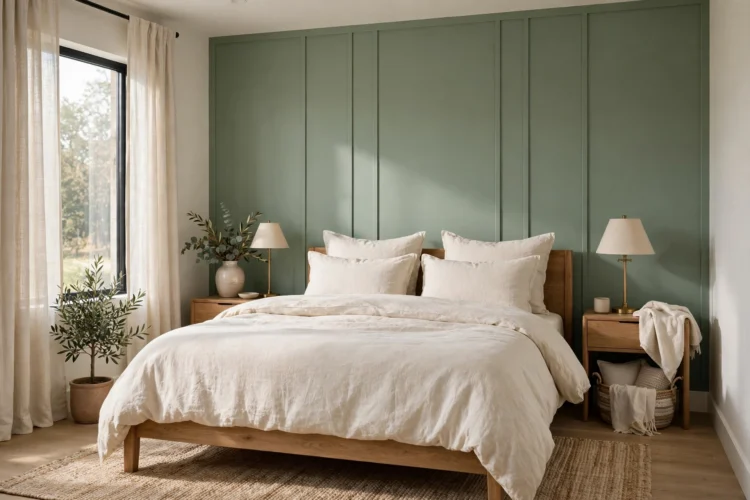
Sage green is the calmest color you can put on a wall. It sits between green and gray, so it reads as a neutral with a gentle personality. Pair it with cream walls, natural wood, and black or bronze hardware for definition. The result feels like a garden room, even in a city apartment.
Use sage on one wall or on lower cabinets, not on every surface. Too much sage turns a room sleepy. Cream keeps it awake. Add texture with linen cushions and a woven rug so the green never looks flat. Sage also pairs well with terracotta pots and brass, which warm it up in winter when the light goes gray.
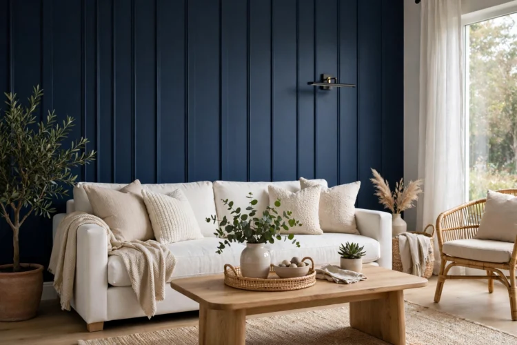
Navy brings depth without the heaviness of black. Pair it with soft white walls and light wood floors, and a room gains a clear focal point. Navy works best on one wall, an island, or a built-in shelf unit. The white around it keeps the room bright, and the contrast makes both colors look richer.
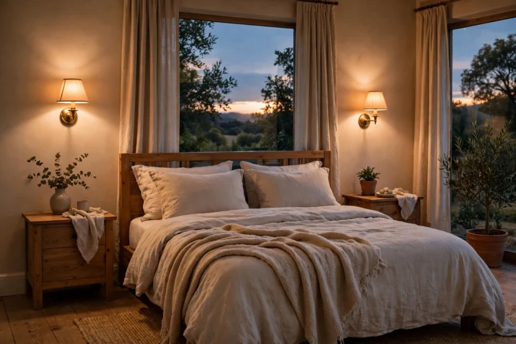
Keep the rest of the room quiet. Linen, pale wood, and one metallic accent, like brass or brushed nickel, are enough. Too many patterns will fight the navy. In a bedroom, navy bedding against white walls feels calm and hotel-like. Add a warm lamp so the navy reads as deep blue, not black, in the evening.
Terracotta brings warmth that no beige can match. Pair it with clay neutrals, cream, sand, and pale stone, and the room feels sunlit even on a cloudy day. This palette suits rooms that get little direct sun, because the warm tones do the work the sunlight cannot.
Use terracotta in objects and textiles first: pots, cushions, a throw, a single painted wall. The rest of the room should stay pale so the terracotta has room to breathe. Natural fibers like jute and rattan fit this palette perfectly. For a bathroom version of the same warm feeling, these bathroom paint color ideas include warm tones that work in small tiled rooms.
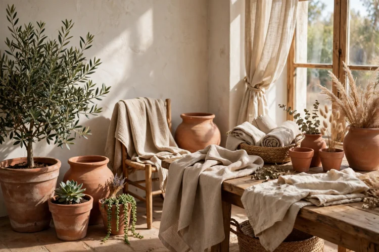
Charcoal and warm gray sound dark, but together they make one of the calmest palettes around. The trick is the word warm. Warm gray has brown or beige in it, so it never looks like concrete. Charcoal on one wall or on cabinetry gives the room weight. Warm gray on the other walls keeps it soft.
Light wood and cream textiles stop this palette from feeling cold. A single plant or a piece of art in a muted green adds life without breaking the calm. This palette works well in home offices and bedrooms, where you want focus and rest in the same room. Keep lighting warm, around 2700K, so the gray reads as cozy instead of industrial.
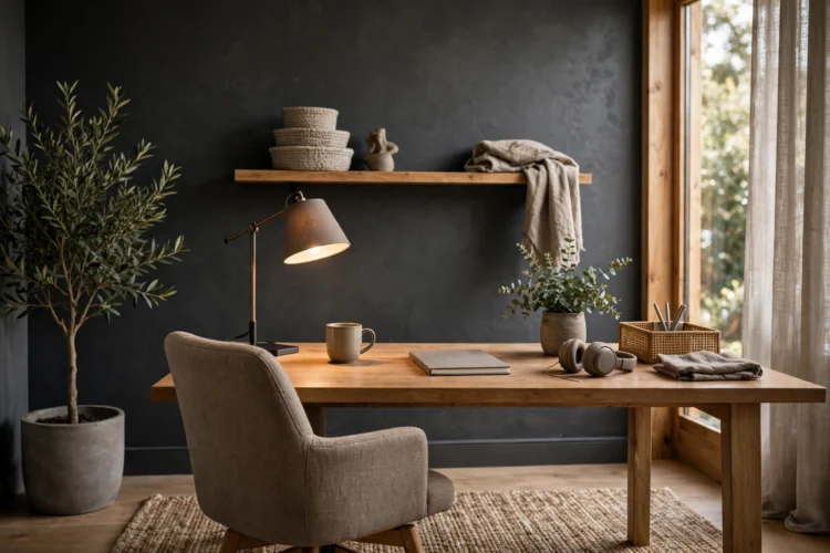
Dusty blue is blue with the volume turned down. It pairs beautifully with natural linen, pale wood, and white. The result feels coastal without a single seashell in sight. Use dusty blue on bedding, curtains, or a single accent wall, and let linen do the rest.
This palette suits bedrooms and bathrooms best, where calm matters most. It is a calm home color scheme that never feels cold. Avoid pairing dusty blue with bright white, which makes it look washed out. Cream or soft ivory works better. A woven basket and a wooden stool add the natural texture this palette needs. If you love this soft blue direction, these neutral bedroom ideas show how pale tones stay interesting with texture.
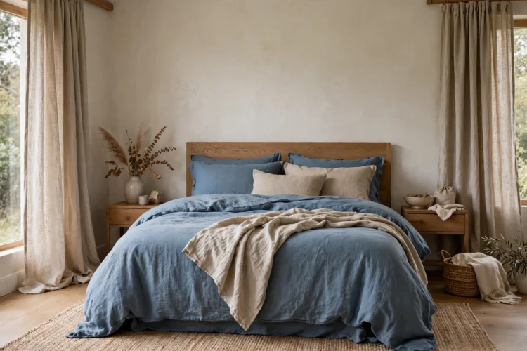
Blush and taupe make a room feel soft without feeling feminine in a narrow sense. Blush here means a dusty rose, not bubblegum pink. Taupe grounds it with a gray-brown that works on walls, sofas, and rugs. Together they feel warm, quiet, and grown up.
Use blush in small doses: cushions, a throw, a piece of art. Let taupe carry the big surfaces. Add black or dark bronze in small details, like a lamp base or a frame, to stop the palette from drifting into sweetness. This combination suits living rooms and bedrooms that get warm afternoon light, which deepens both colors nicely.
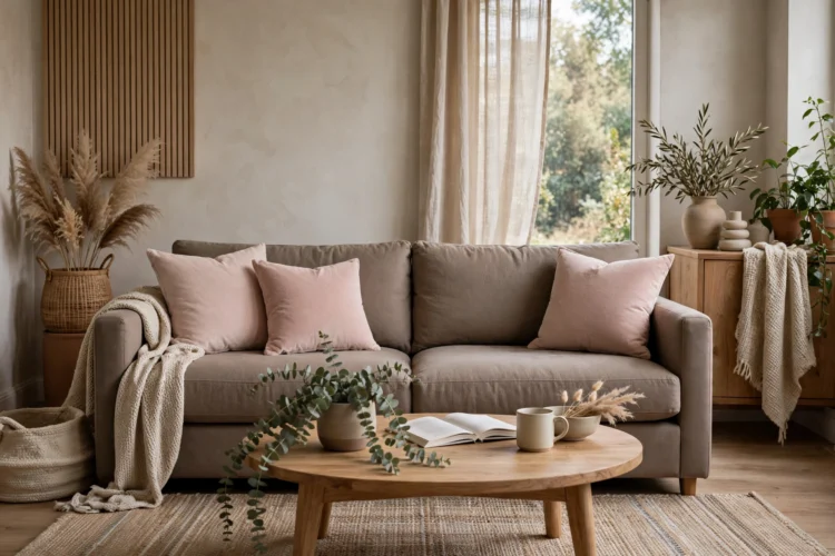
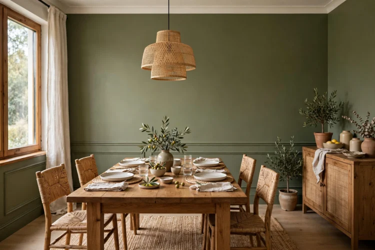
Olive green is sage’s deeper, earthier cousin. Pair it with natural wood, cream walls, and black accents, and the room feels grounded and calm. Olive works well in kitchens and dining rooms, where it pairs with wood tables and ceramic dishes without trying too hard.
Keep olive to one or two elements per room: lower cabinets, a sofa, or a painted wall. The rest should stay light. Cream, pale oak, and stone keep the olive from dominating. For a green-led room that stays calm from floor to ceiling, these green living room ideas show sage-to-emerald palettes room by room.
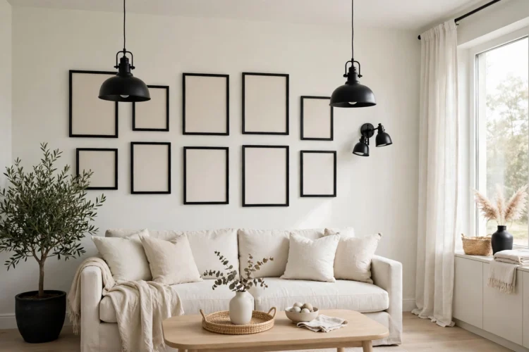
You do not need a dark wall to get the benefit of black. A pale base of white, cream, or pale gray with black accents, in frames, handles, light fixtures, and chair legs, gives a room definition. The black draws the eye to the lines of the furniture and makes the pale colors look intentional instead of unfinished.
Use black sparingly. Five to ten percent of the room is enough. A black mirror frame, a black pendant light, and black cabinet pulls can carry the whole palette. Too much black flips the room from calm to dramatic, which is a different goal. Keep the black matte, not glossy, so it reads as soft and modern.
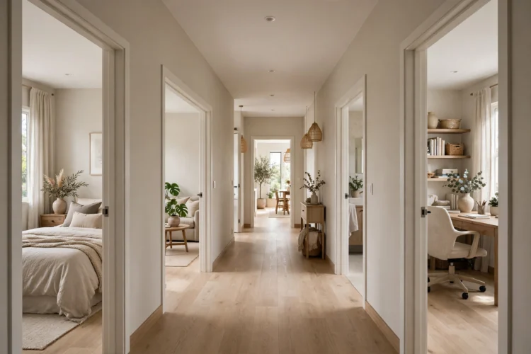
A cohesive whole home palette does not mean every room is identical. Pick your palette once, then vary the proportions room by room. The living room might be eighty percent neutral with a strong accent wall. The bedroom might flip it, with more of the supporting tone and less accent. The hallway carries the neutral and one small echo of the accent, like a runner or a framed print.
Paint the hallway and the rooms you pass through most in the dominant neutral. That shared color is what makes the house feel like one home instead of a set of separate rooms. Test your palette in the hallway first, since it touches every other room. When the hallway feels right, the rest of the house usually follows.