Physical Address
304 North Cardinal St.
Dorchester Center, MA 02124
Physical Address
304 North Cardinal St.
Dorchester Center, MA 02124

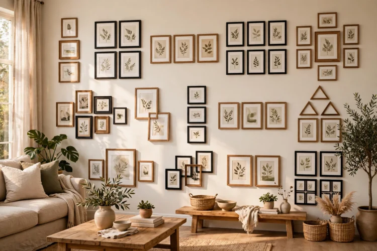
A blank wall is the easiest room to fix and the hardest to start. These 14 gallery wall layouts cover grids, salon hangs, ledges, and staircases, with spacing rules that keep every arrangement looking deliberate.
Gallery wall layout ideas solve the same problem in every home: a big blank wall and a pile of frames with no plan. The difference between a wall that looks collected and one that looks random is rarely the art itself. It is the spacing, the alignment, and the decision about which pieces lead and which ones follow. The fourteen layouts below cover the arrangements that work in real rooms, from a tight grid above a sofa to a salon hang that climbs a staircase. Each one includes the spacing that keeps it looking deliberate and a paper-template trick that lets you test the whole arrangement before you put a single nail in the wall. Pick the layout that fits your wall, your frames, and the amount of patience you have on a Sunday afternoon.
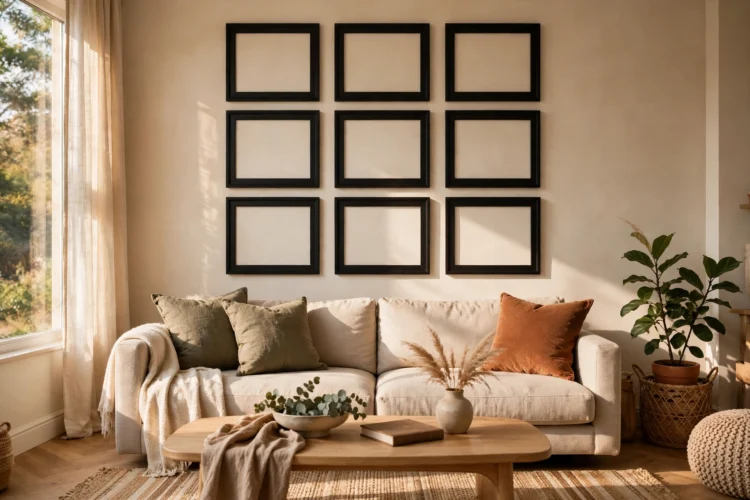
A grid is the most forgiving starting point among gallery wall layout ideas, and it suits rooms that already have a lot going on. Choose frames in one size, or two sizes at most, and keep the gallery wall spacing even, usually 5 to 8 centimeters between frames. The even spacing does the work, so the art inside can be as mixed as you like: photos, prints, and kids’ drawings all look intentional inside a strict grid. Start by measuring the wall and the sofa below it, and keep the whole grid about two-thirds the width of the furniture underneath.
The second grid idea breaks the pattern on purpose. Leave one square empty in the middle of the grid and hang a small clock or a round mirror there instead, which gives the eye a place to rest. Or run the grid in two rows of three and leave the bottom row short by one frame, which reads as a deliberate pause rather than a mistake. A grid gallery wall works best with matching frames in black, white, or natural wood, since the frames disappear and the pictures carry the arrangement. If your frames are a mixed set, save them for the salon hang below and keep the grid uniform.
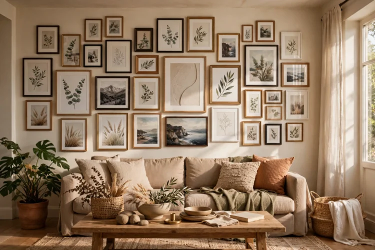
A salon style gallery wall is the layout for people who collect art slowly and never want to stop. Frames of different sizes and finishes pack tightly together, edge to edge, with gaps of 3 to 5 centimeters, and the arrangement grows one frame at a time. Start with your largest piece at eye level, slightly left of center, then build outward and upward, filling gaps as new pieces arrive. The trick is to keep one thing consistent, usually the frame color or the mat color, so the mix reads as a collection instead of a jumble.
The floor-to-ceiling version takes the same idea and fills the whole wall, from the skirting board to the cornice, which suits a narrow hallway or the wall beside a staircase. Because the salon hang has no fixed border, you can add a frame whenever you find one, and the wall never looks finished, which is the point. Keep the bottom row at least 15 centimeters above the furniture so nothing gets knocked, and step back every three frames to check the balance. Our guide to gallery wall ideas for a personal living room shows how a salon hang can carry family photos next to art prints without either side looking out of place.
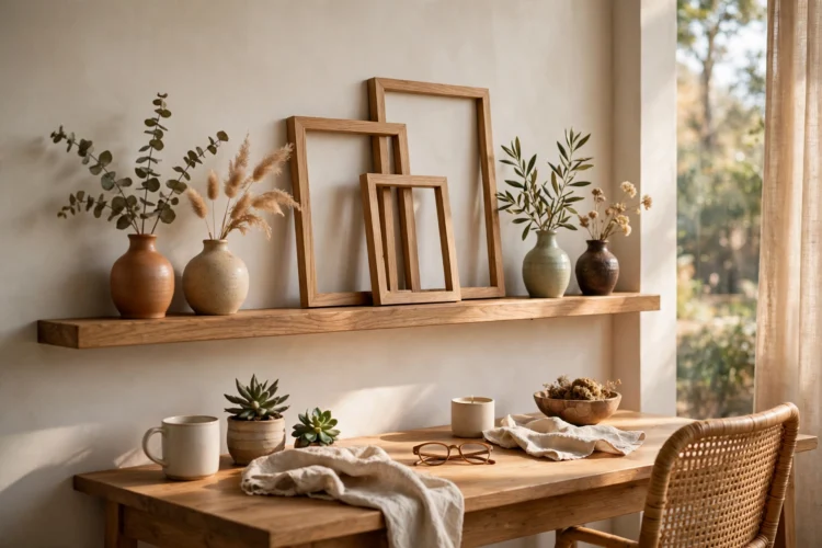
A picture ledge wall starts with a shallow shelf with a lip that holds frames upright, and it is the layout for anyone who rearranges often. Hang one long ledge at eye level, lean the frames against the wall, and overlap them slightly so the front frames hide the edges of the ones behind. Swapping a print takes ten seconds, and there are no new nail holes to fill. A single ledge above a sofa or a desk holds three to five frames, and the lip keeps everything upright even if the wall is not perfectly straight.
Two ledges stacked 30 to 40 centimeters apart double the display and create a layered look that suits a dining room or a bedroom. Put larger frames on the lower ledge and smaller ones above, so the arrangement reads bottom-heavy and stable. Ledges also hold objects that would never survive a nail, like small vases, books, and souvenirs from trips, which makes the wall feel personal instead of curated. If your frames are mismatched or thrifted, our ideas for picture frame upcycle ideas for gallery walls show how a coat of paint unifies a mixed set before it goes on the ledge.
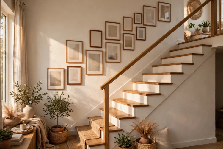
A staircase wall is the most underused gallery space in the house, and it suits a layout that climbs with the steps. Hang frames so the center of each one sits about 150 centimeters above the tread directly below it, which keeps the line parallel to the slope of the stairs. The arrangement looks natural because it follows the architecture, and it turns a passage you rush through into a place worth slowing down for. Mix family photos with small landscapes, since the staircase is where guests actually stop and look.
The landing cluster is the second staircase idea, and it anchors the climb. Fill the flat wall at the landing with a tight group of five or seven frames, then let one or two frames continue up the next flight. The cluster gives the eye a destination, and the single frames above it keep the rhythm going. Keep the frames small on a staircase, since you view them from close up and from an angle, and avoid glass that catches the light from the window at the top of the stairs. For more ways to use the walls around a television and a staircase, our roundup of TV wall ideas from gallery style to built-ins covers the same balance of art and furniture.
When a wall feels too big for small frames, start with one anchor piece that covers at least a third of the width you want to fill. A large canvas, an oversized photograph, or a framed textile gives the wall a center of gravity, and the smaller frames around it become supporting players instead of lost postage stamps. Hang the anchor first, centered on the furniture below, then add two or three smaller frames on one side and one on the other, keeping the gaps even.
The trio version uses three oversized frames of the same size hung in a row, which reads as one big statement and suits a long, low wall above a sideboard or a bed. The three frames should share a subject or a color, such as three black-and-white prints from the same trip, so the row feels like a set rather than three separate decisions. Leave 8 to 10 centimeters between the frames, and keep the bottom of the frames about 15 to 20 centimeters above the furniture, which is the gap that keeps the arrangement connected to the room instead of floating.
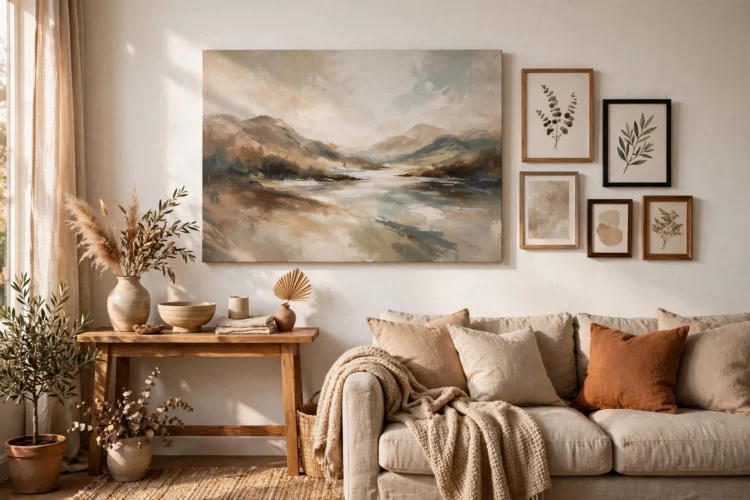
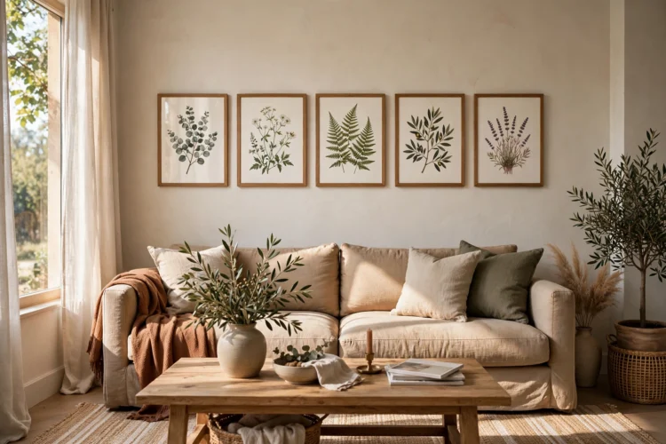
A horizontal band is a single row of frames hung in a straight line, and it is the cleanest layout for a wall above a sofa or a bed. The frames sit at eye level, the tops align, and the row runs about two-thirds the width of the furniture below. The line gives a low room a sense of width, and it suits a set of prints that share a theme, like botanical drawings or travel photos. Use frames in one size for the calmest result, or step the sizes down from the center outward for a gentle arc that still reads as a line.
The hallway version runs the same band along a long corridor, which is the wall most homes leave completely blank. Hang the frames at the same height from end to end, and keep the spacing even, even if the frames differ in size. A hallway band works with as few as four frames, and you can extend it later by adding frames to either end. Because hallways are narrow, choose prints with simple subjects and pale mats, so the wall adds interest without making the passage feel busy.
A corner wrap turns two walls into one display by running frames around the corner, which suits a reading nook or the end of a living room. Hang the largest frame on the main wall, then continue the arrangement around the corner with smaller frames, keeping the same height line so the two walls read as one continuous gallery. The corner itself becomes a feature instead of a dead angle, and the wrap makes a small room feel larger because the eye keeps traveling.
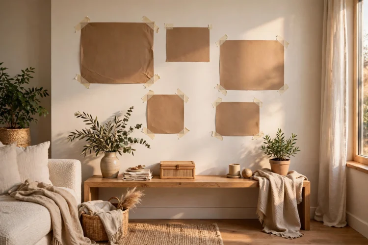
Before you hang anything, test the layout with the paper template trick, which is the fourteenth idea and the one that saves the most patching. Trace each frame onto kraft paper, cut the shapes out, and tape them to the wall with painter’s tape. Live with the paper version for a day, move pieces around, and only pick up the hammer when the paper wall looks right. Mark the nail spot through the paper, then remove the paper and hang the frame. For art that needs no frame at all, our DIY wall art ideas that look gallery-worthy offer pieces you can make in an afternoon and hang with the same template method.
Start with the layout that matches your wall, not the one you saw in a photo. Hang the paper version first, step back, and trust what you see. The wall will tell you when it is done.