Physical Address
304 North Cardinal St.
Dorchester Center, MA 02124
Physical Address
304 North Cardinal St.
Dorchester Center, MA 02124

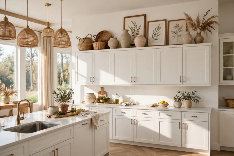
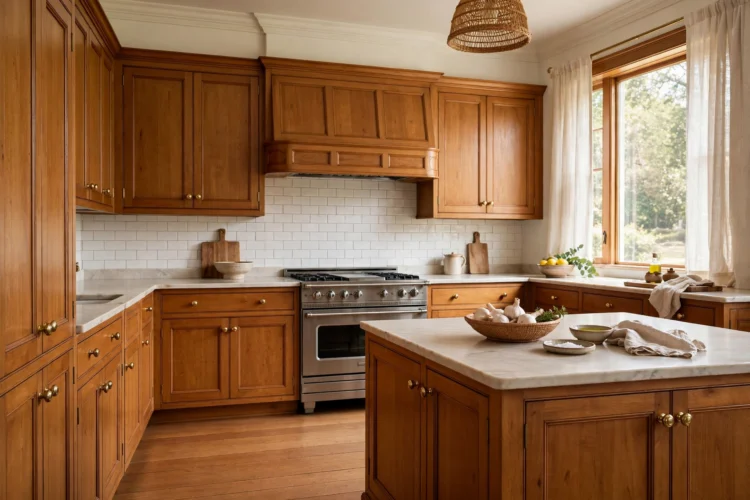
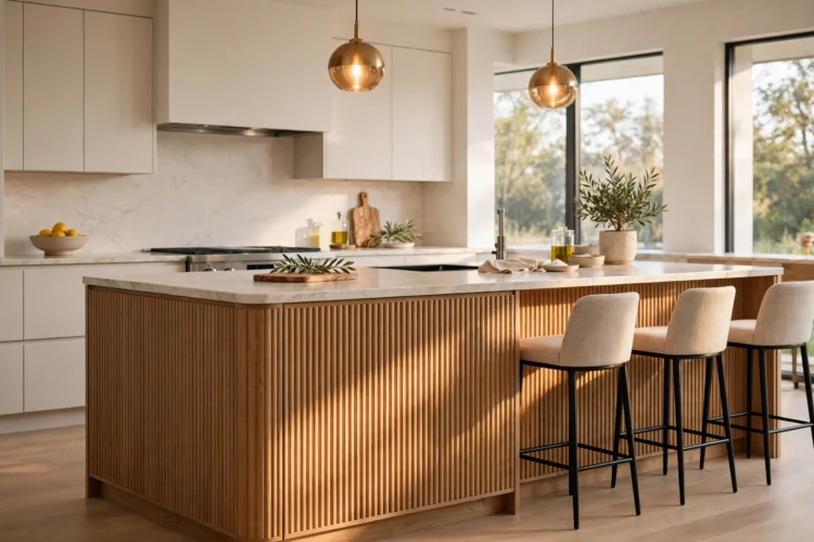
A good kitchen color scheme names every surface at once. These twelve complete palettes cover cabinets, counters, metals, and accents so you can copy one wholesale.
Picking kitchen colors one at a time is how rooms end up with a cabinet color that fights the countertop and a metal finish that matches nothing. These kitchen color schemes work the other way. Each one names a complete palette, covering cabinets, counters, metal, and accent, so you can copy it wholesale instead of guessing how four separate choices will look together. Read through the twelve, pick the one that fits your light and your floor, and use it as the plan.
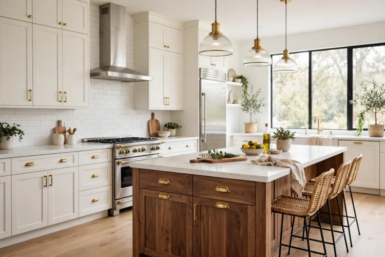
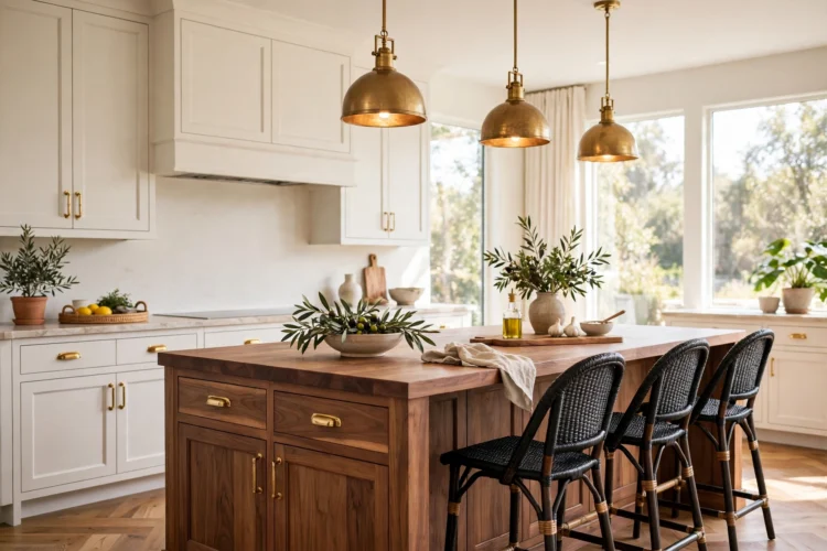
Warm white cabinets, a walnut island or wood shelves, a white quartz counter, and brass hardware make the most forgiving palette in this list. The warm white keeps the room bright, the walnut adds the warmth and grain that white alone cannot, and the brass ties the two together. This palette suits almost any floor, from pale oak to dark slate, because the wood tone in the room is flexible.
Use it when you want a kitchen that will still look right in ten years. The only rule is to keep the white warm, not bright, so it does not clash with the walnut. A warm white with a cream undertone sits next to wood naturally, while a stark white can make the wood look orange by comparison. For cabinet color ideas that pair well with wood, see these kitchen cabinet color ideas beyond basic white.
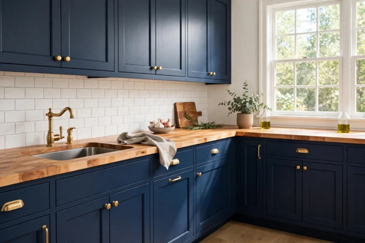
Navy lower cabinets, white uppers, a butcher block counter, and brass hardware make a classic palette with real contrast. The navy gives the room depth, the white uppers keep it light, and the wood counter stops the whole scheme from feeling cold. Brass warms the navy further and gives the eye bright points to rest on. This palette suits kitchens with good natural light, since the navy needs daylight to show its blue rather than reading as black.
Keep the backsplash pale, such as white subway tile or light marble, so the navy has a bright band above it. A dark backsplash with navy cabinets can close the room in. These butcher block countertop ideas show how the wood counter behaves across different cabinet colors.
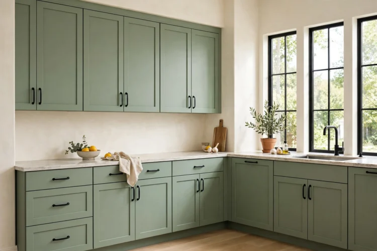
Sage cabinets, cream walls, a pale stone counter, and matte black hardware make a calm palette with a sharp edge. The sage carries the color, the cream keeps the room light, and the black hardware stops the soft colors from going dull. This palette suits kitchens that lean modern farmhouse or Scandinavian, and it works in both large and small rooms because sage is a mid-tone that does not close a space in.
Repeat the black three times, on the hardware, the faucet, and one light fixture, so it reads as a system. A single black element in a sage and cream room can look like a mistake. For the full range of green cabinet colors, see these green kitchen cabinet ideas from sage to forest.
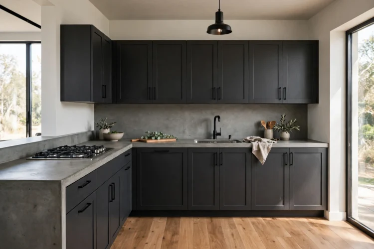
Charcoal cabinets, a concrete-look counter, pale oak floors, and black hardware make a modern palette with industrial roots. The charcoal gives the room weight, the concrete counter adds texture without pattern, and the oak floor warms the whole scheme up. This palette needs strong task lighting, because dark cabinets absorb light, so plan under-cabinet strips and bright pendants before you commit to the color.
Use it in kitchens with large windows or an open plan, where daylight and the adjoining room keep the dark surfaces from closing in. A pale backsplash, such as light gray tile or white stone, gives the room one bright band. Without it, the charcoal and concrete can blur into one dark mass after sunset.
Butter yellow cabinets or a butter yellow island, white walls and uppers, a white counter, and chrome hardware make a sunny palette that still feels current. The yellow should be soft and buttery, not bright or lemon, so it reads as warm rather than loud. Chrome keeps the scheme crisp and modern, while a wood floor or wood stools stop it from feeling cold. This palette suits kitchens with little natural light, because the yellow warms the room even on gray days.
Keep the yellow to one surface, either the lowers or the island, and let white carry the rest. A whole butter yellow kitchen can feel like a single color wash, while one yellow anchor with white around it feels deliberate. Small yellow details, such as a kettle or a row of canisters, can repeat the color without adding another painted surface.
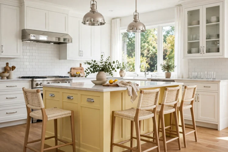
Terracotta tile or a terracotta accent wall, olive lower cabinets, a natural stone counter, and bronze hardware make an earthy palette with real depth. The terracotta brings warmth, the olive brings a plant tone, and the stone ties them together with a neutral surface that has its own texture. This palette suits kitchens with warm wood floors and plenty of natural light, since the warm colors glow in sunlight.
Balance the warm tones with a pale ceiling and a light wood or stone floor so the room does not get too dark. The palette is rich, so keep the accessories simple: clay pots, linen towels, and a wooden bowl do more here than a collection of colored objects. Bronze hardware suits this scheme better than chrome, because chrome can look cold against terracotta and olive.
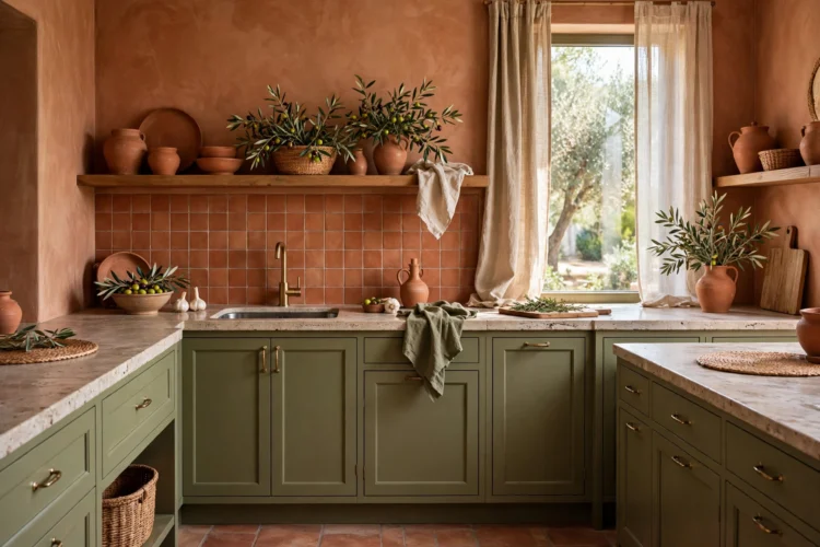
Powder blue cabinets, white walls, a white counter, and light wood accents make a fresh palette that feels calm and coastal. The blue should lean soft and slightly gray rather than bright, so it reads as a muted color rather than a statement. Light wood, such as pale ash or white oak, warms the blue up, while chrome or nickel hardware keeps it crisp. This palette suits small kitchens well, because the light colors keep the room feeling open.
Use the blue on the lowers and keep the uppers white, or paint the island blue and leave the perimeter white. Either way, the blue stays contained and the room stays bright. A powder blue backsplash with white cabinets gives the same feeling at a lower cost if repainting cabinets feels like too much.
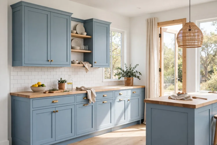
Black and white cabinets, a white counter, black hardware, and one warm accent, such as a walnut island top or brass pendants, make the most graphic palette in this list. The black and white give the room strong contrast, and the single warm accent stops it from feeling stark. This palette suits modern and transitional kitchens, and it works in any size room because the contrast itself defines the space.
The warm accent is the key. Without it, black and white can feel cold and flat. With it, the room has a focal point and a warm note that the eye returns to. For more ways to use the contrast, see these black and white kitchen ideas with timeless contrast. For a softer take on the same idea, these two-tone kitchen cabinet ideas for a custom look show how two cabinet colors can share one room.
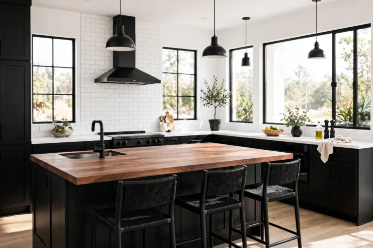
Pick one palette from this list and write down its four parts before you buy anything. When every surface is named in advance, the room comes together on the first try instead of through a series of small fixes.