Physical Address
304 North Cardinal St.
Dorchester Center, MA 02124
Physical Address
304 North Cardinal St.
Dorchester Center, MA 02124

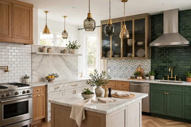
From classic white subway tile to marble slabs, patterned tile, glass, brass, and stainless steel, these 14 kitchen backsplash ideas cover familiar favorites and bolder statement looks.
The backsplash sits at eye level, so it shapes how the whole kitchen feels. If you are gathering kitchen backsplash ideas, start here: this list includes 14 numbered ideas in seven groups, from classic subway tile and handmade-look ceramics to marble slabs, bold patterns, glass, metal, and a few unexpected materials. For each idea, you will see the finish, grout or layout detail, and the cabinet pairing that makes it work.
Subway tile works because the shape is simple and the layout sets the mood. Running bond feels calm and classic. A beveled edge adds small shadows, so the wall has depth even in one color.
Grout changes the result more than most people expect. Bright white grout almost disappears. Light gray gives soft definition. Dark grout turns the same tile into a graphic grid, which pairs well with black hardware.
Lay glossy white ceramic subway tile in running bond, offsetting each row by half a tile. Pair it with warm white Shaker cabinets and simple knobs. Choose bright white grout for a seamless wall, light gray for definition, or charcoal for contrast.
Deep green beveled subway tile adds color without adding pattern. The bevel catches light along each edge, which keeps a small kitchen from feeling flat. Use running bond for a classic look or stack the tile vertically for height. Match the grout to the tile so the green reads as one smooth field.
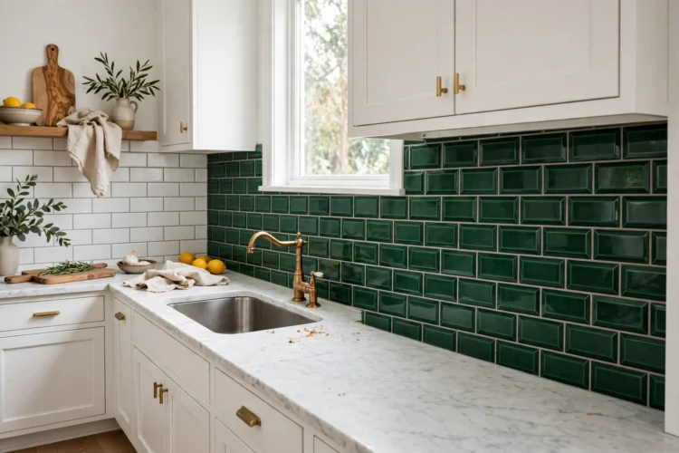
Handmade-look tile has slight variation in tone and edge, so the wall feels warm without looking rustic. The glaze often pools at the edges and catches the light. Keep the layout simple and let that variation be the detail.
This group suits flat-panel or Shaker cabinets and quiet counters. If the tile is the star, keep hardware simple and avoid a second pattern nearby.
Glossy white zellige-look tile gives you the handmade glow with a more even surface than true zellige. The soft variation in the glaze keeps an all-white kitchen from feeling flat. Use a warm white grout and pair it with light wood cabinets for a calm, bright result.
Sea blue handmade-look ceramic tile moves from pale aqua to deeper teal across the wall. A vertical stack makes the ceiling feel higher. Pair it with white upper cabinets, natural wood lowers, and brushed nickel hardware. Keep the counter simple so the blue stays the focus.
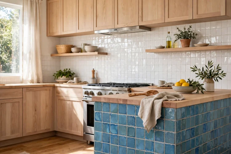
A slab backsplash removes grout lines and lets the stone’s veining carry the design. It works best when the stone is the focal point and nearby surfaces stay quiet. Choose the slab first, then pick cabinets and counters that do not compete.
Marble can etch or stain, so wipe up acids quickly and seal the stone. Travertine is softer and more matte, with a warm, pitted texture that suits relaxed kitchens.
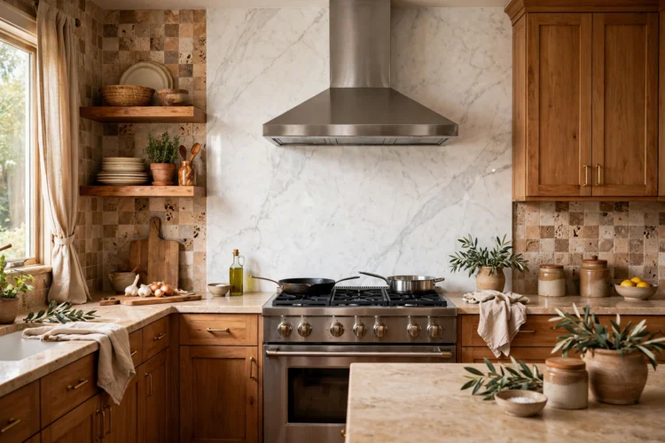
Run one marble slab from the counter to the hood or ceiling behind the range. Soft gray veining on white marble pairs well with simple white cabinets and minimal hardware. Keep the counters quiet so the veining stays the star. Seal the marble and clean splatter promptly.
Tumbled travertine has a matte, gently pitted surface that feels warm and relaxed. In a kitchen with honey-toned wood cabinets, choose a cream or beige stone and a grout color close to the tile. The result is soft and cohesive, especially with warm lighting.
Pattern adds energy, so give it room to breathe. Keep cabinets solid and counters quiet when the backsplash carries the design. A limited palette also helps: two or three colors feel lively without turning busy.
Plan the layout around outlets and the range. Center the pattern behind the cooktop or sink, then let it run cleanly to the cabinets. Order extra tile so cuts and outlets do not break the repeat.
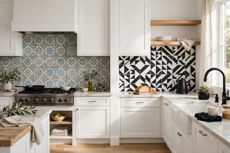
Patterned cement-look tile brings an encaustic feel with easier care than true cement tile. Blue-and-white or terracotta-and-cream patterns pair well with white Shaker cabinets and wood floors. Use a neutral grout that matches the background color so the pattern stays crisp.
High-contrast black-and-white geometry makes a clear statement. Triangles, hexagons, or bold stripes all work when the rest of the kitchen stays simple. Pair the tile with white cabinets, a solid light counter, and black hardware. Keep the pattern to the backsplash only.
Glass bounces light around the kitchen, which helps darker corners feel brighter. Metal adds a jewelry-like finish that pairs well with simple cabinets. Both surfaces show smudges, so choose finishes you are happy to wipe.
Keep the area around glass or metal calm. Solid counters, quiet cabinet colors, and minimal hardware let the reflective finish stand out without visual noise.
Smoked glass tile has a moody gray-green depth and a glossy surface that glows under cabinet lighting. It suits charcoal or dark walnut cabinets with a light counter for balance. Use dark gray grout so the joints recede and the glass reads as one luminous field.
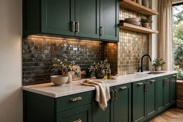
Brushed brass-look metal tile adds warmth and a soft shine. It pairs well with deep green or navy cabinets and a quiet white counter. Match the grout to the tile tone, and keep nearby hardware either matching brass or simple matte black. If a full wall feels strong, use it as a framed accent behind the range.
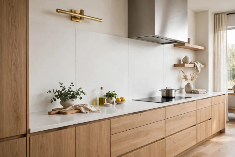
If you like the calm look of stone but not the grout maintenance, carry a slab material up the wall. Quartz and large porcelain panels create long, quiet lines. The effect suits modern kitchens with flat cabinet fronts.
Plan panel sizes around the range and sink so seams fall in quiet spots. Color-matched grout or tight joints keep the surface reading as one piece.
Use the same quartz as your countertop and run it up the backsplash wall. A soft white quartz with faint veining pairs well with light oak cabinets and slim black pulls. The continuous surface makes a small kitchen feel larger and calmer.
Large porcelain panels cover the wall with very few joints. Marble-look or concrete-look panels suit modern kitchens with handleless cabinets. Choose a grout color matched to the panel so the lines nearly disappear. The result is sleek, calm, and easy to wipe.
Brick and stainless steel are not the usual pretty picks, but both handle heat and splatter well. The key is placement and finish. Keep nearby materials simple so the texture reads clearly.
Seal porous materials and choose scrubbable finishes near the range. A simple cabinet color and quiet counter let brick or steel be the feature without fighting for attention.
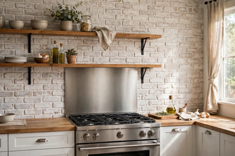
Whitewashed brick veneer adds texture while staying light. The whitewash lets hints of red and brown show through, which warms up white cabinets and wood open shelves. Use a light mortar color and seal the surface so it wipes clean. Keep it slightly away from the highest-heat burners.
A brushed stainless steel panel behind the range handles splatter and wipes clean. It pairs well with white or gray cabinets and simple hardware. Brushed finishes hide marks better than polished ones. Keep the rest of the backsplash simple so the steel reads as a clean, practical feature.
Before you buy, tape large samples to the wall and check them in morning light, evening light, and with the under-cabinet lights on. The winner is the one that still looks right in all three.