Physical Address
304 North Cardinal St.
Dorchester Center, MA 02124
Physical Address
304 North Cardinal St.
Dorchester Center, MA 02124

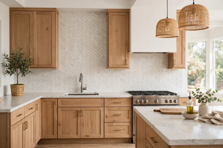
Nine herringbone backsplash ideas that bring quiet movement to a kitchen, with tile sizes, grout colors, and cabinet pairings for each one.
A herringbone backsplash is one of the few patterns that reads as texture instead of noise. The zigzag gives the wall quiet movement, and because the repeat is tight and rhythmic, it never shouts for attention. These nine ideas show how to use the pattern across tile types, colors, and kitchen sizes, from classic white subway to matte black and small-scale moments like niches and shelf walls. Each one includes the tile size, grout color, and cabinet pairings that make it work, so you can picture the finished wall.
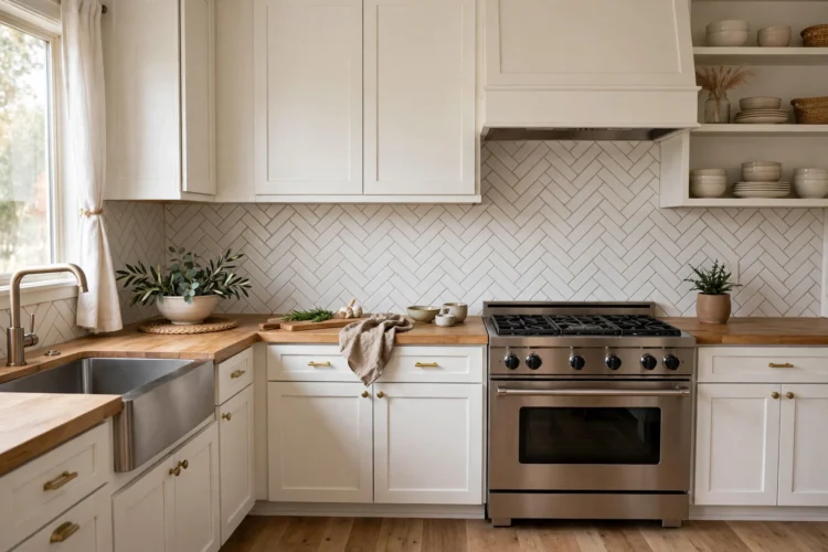
White subway tile set in herringbone is the reason the pattern became a kitchen staple. The tiles themselves are plain rectangles, glossy or matte, but laid at ninety degrees they catch light along their edges and throw soft shadows across the wall. The result has depth without color, which is the whole idea of quiet pattern.
This is also the most forgiving place to start. White tile hides layout mistakes better than dark tile, and it works with nearly any cabinet style, from Shaker to flat-panel. Keep the grout close to the tile and the palette stays calm. Push the grout darker and the zigzag sharpens into a graphic line.
Use standard 3-by-6-inch subway tiles with light gray grout lines at one-sixteenth of an inch. The gray is pale enough to keep the wall bright but dark enough to trace the herringbone lines, so the pattern reads clearly from across the room. Lay the field from the center line outward so the zigzag mirrors itself over the range, and continue the pattern up to the underside of the cabinets without a border.
Pair it with white or warm white Shaker cabinets, a honed black granite or butcher-block counter, and brushed nickel hardware. Matte subway tile softens the look further, while gloss bounces more light around a dim kitchen.
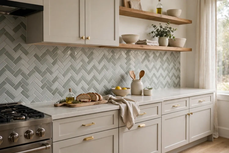
A tinted tile keeps all the rhythm of herringbone and adds a wash of color that never saturates the room. Pale gray, sage, and dusty blue work because they sit close to neutral, so the wall still behaves like a background. The pattern does the talking; the color just sets the tone.
Match the grout to the tile or go one shade lighter. A close grout color lets the color field look continuous, and the herringbone edges pick up light instead of drawing hard lines. This is the combination to choose when you want the backsplash to feel like wallpaper rather than tile.
Two-by-six-inch tiles in a soft dove gray give the zigzag a misty, low-contrast look. Gray grout one shade darker keeps the joints from glowing white, which is what makes gray tile read calm instead of busy. This pairing suits white upper cabinets with light oak lowers, plus stainless appliances that echo the cool tone.
Muted sage green is a gentle way to bring color into a kitchen without committing to a statement wall. The green reads almost neutral next to warm white cabinets, and a cream or warm gray grout keeps the joints soft. Brass or unlacquered bronze hardware pulls out the warmth in the green and keeps the whole wall from feeling flat.
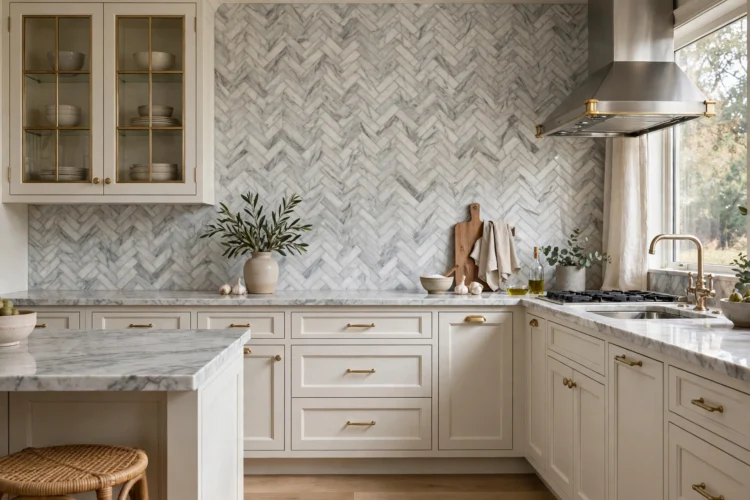
Marble brings natural veining into the pattern, so no two tiles are alike and the wall never looks stamped out. The palette stays near white and gray, which means the herringbone still reads as quiet even though every piece is different. It is pattern plus variation, but both stay inside a soft range.
Marble is softer than ceramic and needs sealing, so reserve this for cooks who wipe down the range wall regularly. In return you get a backsplash that changes subtly with the light: the veins gray out under warm bulbs and sharpen in daylight.
One-by-four-inch or two-by-six-inch Carrara strips keep the veining small-scale so it does not fight the zigzag. Warm white grout blends the joints into the stone, and a matte or honed finish kills glare that would blur the veining. Pair it with simple white cabinets and a marble-look or light quartz counter so the backsplash is the only natural stone in the room.
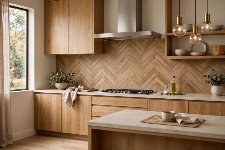
Wood-look porcelain gives you grain warmth with none of the upkeep of real wood behind a stove. The long planks read as timber at first glance, but the herringbone layout keeps them orderly, so the wall feels crafted rather than rustic. It is a good fit for modern kitchens that feel too cold in all-white tile.
Choose a matte finish and a grout color that matches the tile body. Glossy wood-look tile breaks the illusion under cabinet lighting, and pale grout would chop the planks into a checkerboard. Flat-panel cabinets in white, warm gray, or deep green let the grain carry the texture.
Four-by-sixteen-inch or six-by-twenty-four-inch planks laid at ninety degrees make a bold zigzag with long, clean lines. A mid-tone oak or walnut color warms up gray cabinetry, and black window frames or a black faucet echo the dark joints. Keep the rest of the palette simple: one warm metal, one stone counter, and let the herringbone do the work.
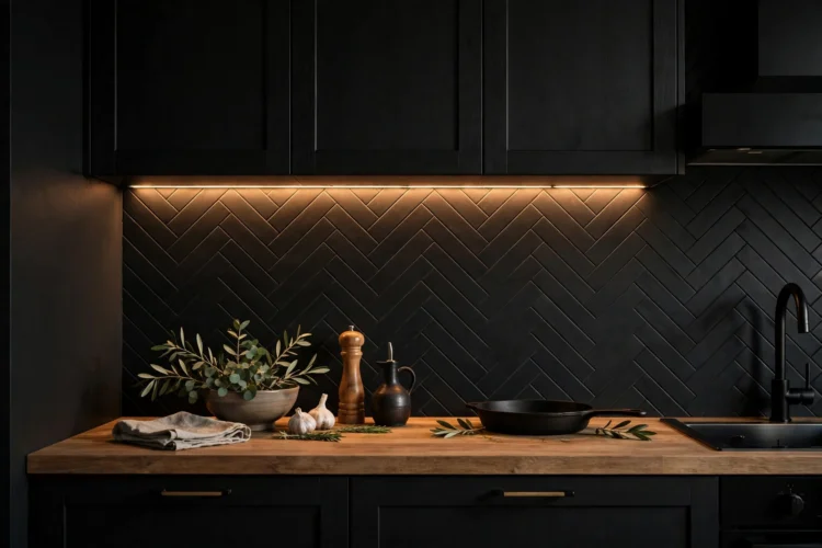
Charcoal and matte black herringbone turns the pattern into texture you feel more than see. In dim light the zigzag disappears into the wall; under cabinet lighting the edges glow and the rhythm appears. It is the most dramatic idea here, but the palette is so restrained it never gets loud.
Balance matters with dark tile. Light counters, pale uppers, or a white ceiling keep the kitchen from closing in. Undercabinet lighting is not optional here: without it, the pattern vanishes and you paid for texture you cannot see.
Two-by-eight-inch tiles in charcoal with matching dark gray grout make the joints disappear, so the wall reads as one continuous zigzag of shadow and sheen. A honed white quartz counter cuts the darkness at the base, and brass hardware adds a small warm note. This works best on a full wall of tile, from counter to ceiling, where the dark field has room to breathe.
Herringbone does not have to cover the whole wall to earn its place. A small patch of pattern in the right spot draws the eye exactly where you want it and costs less tile, less labor, and less commitment. These three ideas use herringbone as an accent, not a field.
Because the area is small, you can choose a bolder tile or a sharper grout contrast than you would for a full wall. The rest of the kitchen stays quiet, so a little pattern goes a long way.
Mini mosaic sheets with tiles around one inch square make a fine, almost woven herringbone. Try it on a small stretch behind a coffee station or a wet bar, where the tiny scale rewards a close look. Keep the grout in the same color family as the tile so the mosaic reads as texture rather than grid.
Tile only the back wall of a recessed niche or the strip behind floating open shelves in herringbone, and leave the rest of the backsplash in plain stacked tile. The pattern frames whatever sits on the shelf: dishes, glassware, a row of jars. From across the room it looks like a deliberate inset; up close it is the quietest kind of detail.
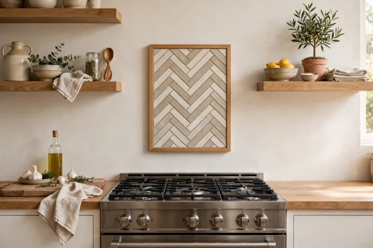
Set a rectangle of herringbone directly behind the range and border it with a simple pencil liner or a metal trim profile. The panel becomes the focal point of the cook wall while the surrounding tile stays plain, which keeps the pattern from overwhelming a small kitchen. Size the panel to the range hood so the two read as one composition.
Before you order tile, tape a sample sheet to the wall and live with it for a full day. Herringbone changes as the light moves, and one day of morning and evening glances tells you more than any showroom visit.