Physical Address
304 North Cardinal St.
Dorchester Center, MA 02124
Physical Address
304 North Cardinal St.
Dorchester Center, MA 02124

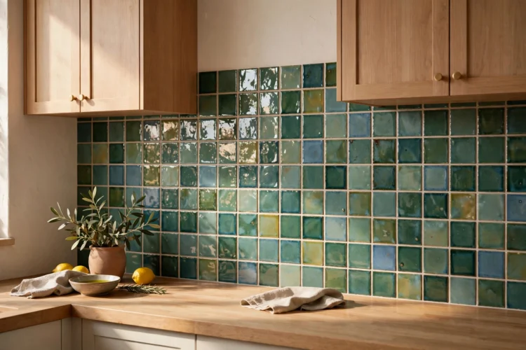
Zellige tile brings handmade glaze, color variation, and soft reflection to a kitchen backsplash. These 11 ideas cover colors, layouts, borders, and small moments that show off its texture.
If you want a backsplash that catches light instead of sitting flat, a zellige tile backsplash is one of the best ways to get there. Each tile is cut by hand and glazed by hand, so no two squares look exactly alike, and that uneven surface turns morning light into a soft shimmer across the wall. Below are 11 ideas grouped by color, layout, and placement, so you can pick the one that fits your cabinets, counters, and the amount of drama you want.
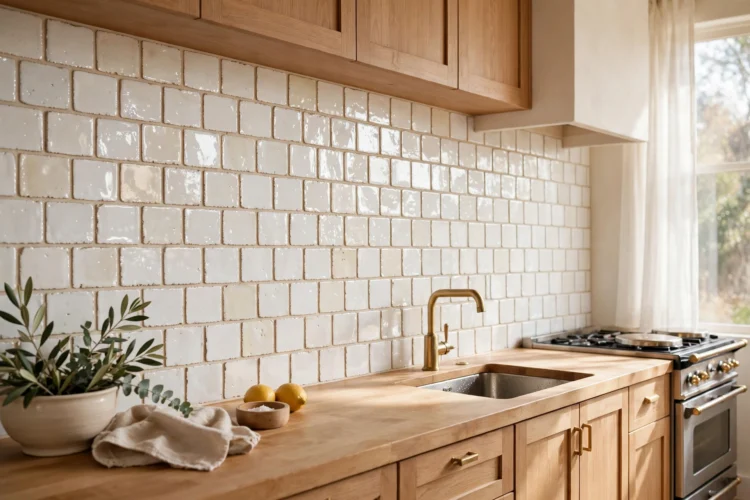
White zellige is the quiet classic. From across the room it reads as a simple white backsplash, and then you step closer and notice the glaze pooling thicker on one edge, a faint ripple on the next tile, a corner that dips just slightly. That is the whole point, and it is why white zellige never looks sterile.
Cream tones bring a warmer version of the same effect. They pair easily with warm wood cabinets, brass pulls, and stone counters with beige veining. A warm white grout keeps the seams soft instead of drawing grid lines over the handmade surface.
This is the layout most people picture first, and for good reason. The offset running bond pattern feels familiar, while the glossy handmade glaze keeps it from looking ordinary. Light bounces off each tile at a slightly different angle, so the wall looks alive without any pattern at all.
Pair it with shaker cabinets in soft white, a honed stone counter with gentle veining, and a warm white grout. A bright white grout can make the handmade edges look messy, while a slightly warm grout lets the tile edges blur into a calm field.
Cream zellige leans into the imperfect edge instead of hiding it. The tiles have a slightly wavy profile, thicker glaze in some spots, thinner in others, and the cream color makes every variation visible without being loud. It is a good choice if your kitchen already has warm tones and a bright white would feel cold.
This works well with medium wood tones, oak floating shelves, and matte black or aged brass hardware. Keep the grout close to the tile color so the wall reads as one continuous handmade surface rather than a grid.
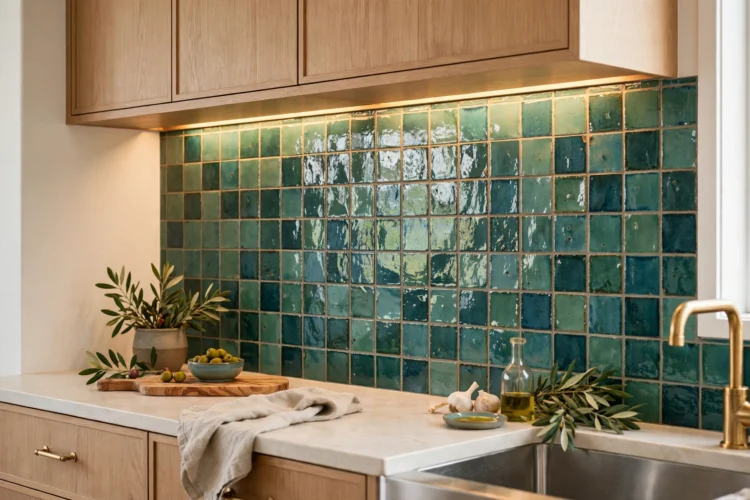
A colored zellige tile backsplash does something a flat colored tile cannot. The glaze varies from tile to tile, sometimes lighter, sometimes darker, sometimes with a soft cloudiness where it pooled. Greens and teals are the most popular colored zellige for kitchens, and they look especially good under cabinet lighting, where the gloss picks up the color and deepens it.
With color, your grout choice sets the mood. A matching-toned grout keeps the wall calm and unified, while a contrasting light grout turns the handmade edges into a visible pattern of their own. Both work, but they give very different kitchens.
Sea green zellige lands in that middle ground between fresh and relaxed. The glaze shifts from pale sage to deeper green across the wall, which means the backsplash changes a little from morning to evening as the light changes. It pairs naturally with white oak cabinets, cream walls, and light stone counters.
Under-cabinet lighting is worth the effort here. A warm strip light grazing down the wall makes the glaze variation glow, and it turns an ordinary weekday evening into something noticeably prettier at the counter.
Deep teal is for kitchens that want real color without going loud. The dark glaze still shows the handmade variation, with some tiles reading almost navy and others catching a green flash in the light. Against white or light gray cabinets, it becomes the clear focal point of the room.
Keep the counters quiet, a honed light stone or a simple white quartz, so the teal can do the talking. Brass or gold-toned hardware picks up the warmth in the glaze and keeps the deep color from feeling cold.
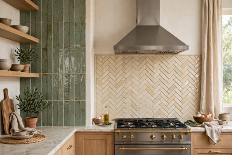
Zellige tiles are small squares, usually around four inches, and the layout you choose changes how their handmade character reads. An offset bond softens the grid, a vertical stack emphasizes the column lines, and a herringbone turns the whole wall into movement. The glaze stays the same, but the pattern decides whether your eye sees calm texture or active pattern.
Small tiles mean a lot of grout lines, so pick a layout you will be happy seeing across the full wall, not just on a small sample board.
Stacking zellige in straight vertical columns gives the backsplash a tailored, slightly tailored look that still shows every ripple in the glaze. The vertical lines draw the eye upward, which can make a kitchen with low ceilings feel a little taller. It suits modern cabinets with clean fronts and minimal trim.
A light gray or greige grout keeps the column lines defined without turning them harsh. It also works well behind a single floating shelf, where the straight columns frame the shelf cleanly.
Herringbone turns zellige into a feature wall. The zigzag pattern multiplies the light play because every tile meets its neighbor at an angle, so the glossy surface catches the range hood light from many directions. Limiting it to the wall behind the range keeps it a focal point instead of overwhelming the room.
Use a single glaze color here, white, cream, or soft green, so the pattern carries the interest. Run the surrounding backsplash in a simpler layout in the same tile so the panel reads as intentional.
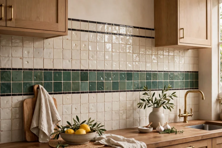
You do not have to commit the whole wall to one color. Two-tone zellige designs, a band of color across a neutral field, or a thin contrasting border, add a custom detail that looks considered rather than decorated. Because zellige tiles are sold in many glaze colors in the same size, mixing tones within one installation is straightforward.
The key is proportion. A border or band should feel deliberate, so plan it at a height that relates to something: the countertop, the underside of the cabinets, or the sightline from the doorway.
A horizontal band of color, say sea green or clay, running across a field of white or cream zellige, gives the backsplash a stripe of personality at eye level. The band can sit just above the counter, where prep happens and eyes land, or align with the bottom of the wall cabinets for a framed effect.
Keep the band to three to five tile rows, and use a grout that matches the field color so the band looks like part of the wall.
A single thin row of contrasting zellige, sometimes called a pencil border, outlines the backsplash like a frame. A dark charcoal or deep green line against a white field is the classic version, and it gives a simple installation a finished, custom edge.
Place the border where the backsplash meets the wall above, or run it as a chair-rail line partway up a taller backsplash. One row is enough. More than that starts to read as a stripe rather than a border.
Some kitchens want the backsplash to be the room. Taking zellige all the way to the ceiling, or choosing a dark moody glaze, makes the tile the dominant surface instead of an accent. This approach works best when the rest of the kitchen is restrained, because the texture and color need visual quiet around them to register.
Full-height and dark zellige both demand good lighting. The gloss needs light to bounce off, so plan for under-cabinet lights, a pendant, or a kitchen with generous windows.
Running zellige from counter to ceiling turns the whole wall into a handmade surface. The light play that looks pretty in a standard backsplash becomes immersive at full height, with the glaze variation shifting across a much larger field. This is especially effective on the range wall or behind open shelving, where the tile has room to be seen.
With no upper cabinets breaking the wall, keep everything else simple: quiet counters, minimal hardware, one shelf at most. The tile is the cabinetry’s replacement as the visual anchor, so let it hold the wall alone.
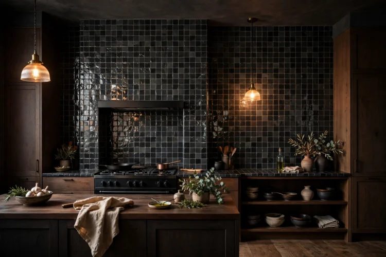
Charcoal zellige is the dark horse of the color range. The near-black glaze still shows handmade variation, with some tiles flashing dark blue or green in the light, and the glossy surface keeps the dark color from feeling flat. In a moody kitchen with dark cabinets and warm lighting, it creates a cocooning effect that lighter tile cannot.
Pair it with warm wood or dark stained cabinets, brass fixtures, and plenty of warm light. A dark grout keeps the wall unified while the gloss provides the reflection the dark palette needs.
You do not need a full kitchen renovation to enjoy zellige. Small applications, a coffee nook, the wall behind floating shelves, a bar corner, give you the handmade texture in a concentrated dose. These spots are also practical starting points if you are unsure about committing to zellige across the whole kitchen.
Small areas let you be bolder with color, since a deep teal or terracotta in a nook will not dominate the room the way it would behind the range.
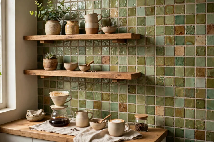
A coffee nook is a natural home for zellige. The area is small, it gets daily use, and it is usually styled with a few objects, which means the tile becomes a deliberate backdrop. A warm cream, soft green, or even a playful terracotta zellige makes the morning coffee station feel like a designed corner rather than a countertop afterthought.
Behind floating shelves, zellige adds texture that shows between and around the styled objects. Keep the shelf styling simple, a few ceramics, a small plant, so the handmade glaze stays visible instead of being fully covered.
Before you order, get a sample board of the exact glaze color and look at it in your kitchen at different times of day. Zellige changes with the light more than any machine-made tile, and a board taped to the wall for a few days tells you more than any photo can.