Physical Address
304 North Cardinal St.
Dorchester Center, MA 02124
Physical Address
304 North Cardinal St.
Dorchester Center, MA 02124

A color-by-color tour of fourteen kitchen cabinet colors beyond basic white, each with concrete pairing notes for counters, hardware, and walls.
Kitchen cabinet color ideas have moved well past the all-white era. Color on cabinets sets the emotional temperature of the whole kitchen: green feels calm and rooted, navy feels crisp and tailored, terracotta feels warm and handmade. Because cabinets cover so much wall, the color you choose does more work than any other single decision in the room.
This tour covers eight standout shades with concrete pairing notes for each: what counters, hardware, and wall colors make it sing, and where it fits best. Order paint samples, tape them to the cabinet doors, and live with them for a few days of real daylight before you commit.
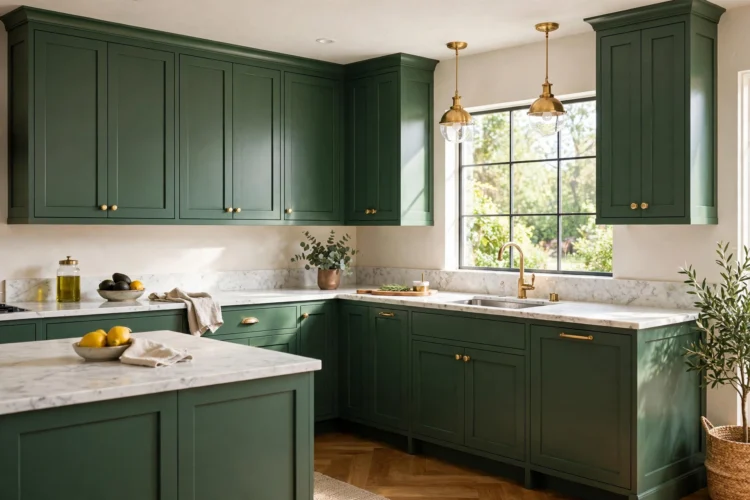
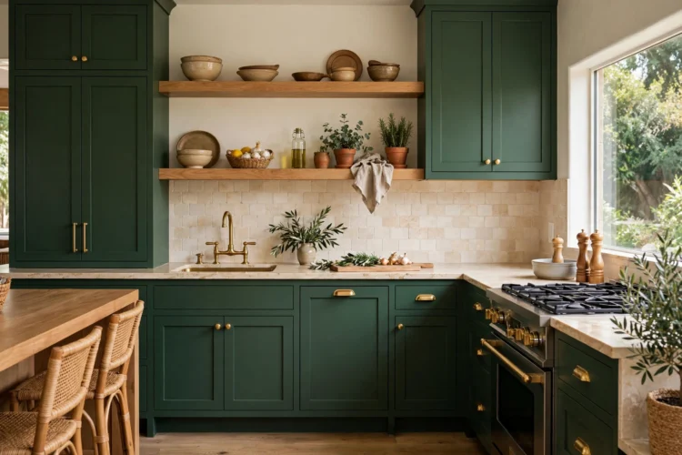
Forest green cabinets bring the calm of a garden indoors without going pastel. The deep, slightly grayed green sits beautifully against white oak floors and open wood shelves, and it makes brass hardware glow. Keep walls a warm white with a hint of cream so the green reads rich rather than cold.
Pair with honed white marble or quartz counters and a simple handmade-look backsplash in warm white. Forest green suits traditional and transitional kitchens best, and it hides everyday wear far better than white. Sample it on a south-facing door first, since green shifts noticeably between morning and evening light. If the whole kitchen in forest green feels bold, start with the island or the pantry wall and live with it for a month first.
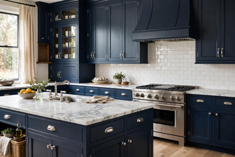
Navy is the tailored suit of kitchen cabinet colors: crisp, classic, and flattering to almost everything around it. White marble counters with soft gray veining are its natural partner, and polished nickel or chrome hardware keeps the look cool and clean. Pale gray-blue walls tie the scheme together without competing.
Navy works on all cabinets in a well-lit kitchen, or on lowers only with white uppers in a darker room. It pairs well with both traditional raised-panel doors and flat modern fronts. Because navy is so established now, it reads as timeless rather than trendy, which helps resale confidence. A runner in faded blues and creams softens the formality underfoot and ties the navy to the rest of an open-plan home.
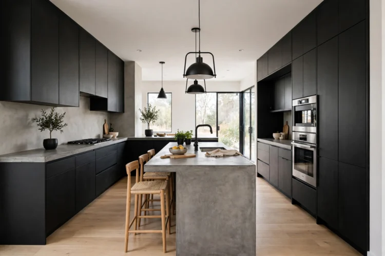
Charcoal or soft black cabinets give a kitchen a quiet, architectural confidence. The key is texture: matte black doors against concrete-look counters and a plaster-look backsplash keep the dark palette from feeling flat. Blackened steel or matte black hardware disappears into the doors for a seamless wall of color.
Balance the darkness with light oak floors and plenty of under-cabinet lighting so the work surfaces stay bright. Charcoal suits modern and industrial kitchens, and it makes stainless appliances blend in instead of standing out. Fingerprints show on high-gloss black, so choose matte or satin finishes for real life. A single open shelf in light oak above the matte black lowers breaks the dark run and gives the eye a resting place.
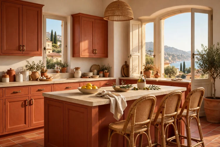
Terracotta cabinets feel sun-warmed and handmade, like a kitchen in a Mediterranean farmhouse. The earthy orange-pink flatters cream walls, rattan barstools, and unglazed ceramic dishware. Aged bronze or oil-rubbed bronze hardware adds to the artisanal feel without competing.
Keep counters light and simple, such as honed limestone-look quartz, so the cabinet color stays the star. A copper pot rail on the backsplash adds a second warm metal that flatters terracotta beautifully. Terracotta fits best in kitchens with warm natural light and natural materials elsewhere in the home. It is a committed color, so test a large sample board for a full week before ordering. Handmade-look backsplash tile in warm white with visible variation keeps the artisanal mood going above the counters.
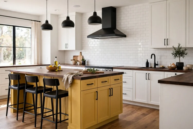
Mustard yellow is the extrovert of cabinet colors: cheerful, retro, and impossible to ignore. It sings against dark walnut counters or open walnut shelves, which ground the brightness with rich brown weight. Matte black hardware and a simple white backsplash keep the look graphic rather than chaotic.
Mustard works best as an accent: a bank of lowers, a pantry wall, or an island, with calmer cabinets elsewhere. Pair it with crisp white uppers so the brightness stays at counter level where it energizes the work zone. It suits mid-century and eclectic kitchens with confidence to spare. Because it is a strong color, keep the wall color neutral and let the cabinets carry the room. Vintage-style globe pendants in smoked glass over a mustard island echo the retro mood without adding more color.
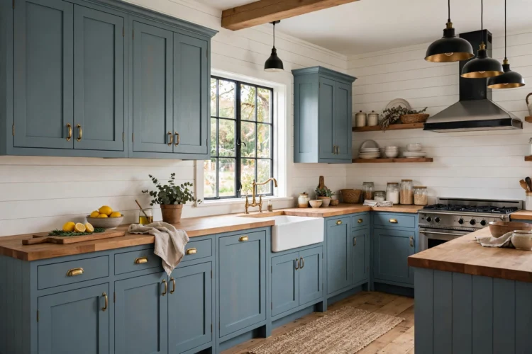
Dusty blue sits between gray and blue, calm enough for a whole kitchen but far more interesting than either neutral alone. Warm butcher block counters keep it cozy, and the wood’s honey tones stop the blue from feeling chilly. Brushed brass or satin nickel hardware both work, depending on how warm you want the mix.
This shade suits farmhouse, coastal, and cottage kitchens, and it pairs naturally with white shiplap walls. Dusty blue shows less wear than darker colors and less dirt than white, a practical middle ground for busy family kitchens. It also photographs beautifully, if that matters to you. A skirted sink in a natural linen fabric adds softness under the butcher block and hides cleaning supplies gracefully.
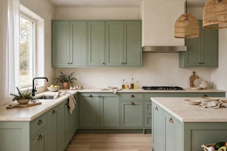
Sage green is the softest way to leave white behind. The gray-green reads as a neutral in most light, pairing effortlessly with linen-colored walls, light oak floors, and creamy stone counters. It brings a breath of the garden into the kitchen without demanding attention.
Sage suits shaker doors and simple hardware in brushed nickel or aged brass. It works across the whole kitchen, uppers and lowers, because it is light enough not to close in the room. Add texture through a handmade-look backsplash and woven barstools to keep the soft palette from feeling flat. Potted herbs on the windowsill pick up the green undertone and make the color feel connected to the garden outside.
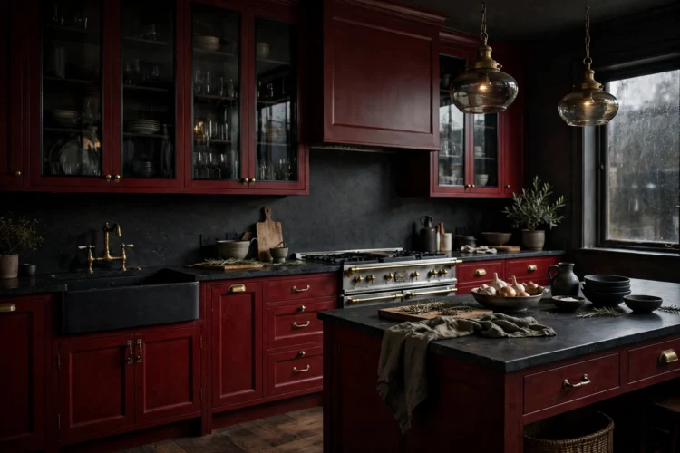
Oxblood, a deep brownish red, gives cabinets the richness of a library or a vintage bar. It pairs dramatically with smoked glass uppers, dark stone counters, and antique brass hardware. Cream or warm gray walls keep the room from going too dark.
Reserve oxblood for kitchens with good natural light and confident style, such as traditional or moody eclectic spaces. It looks best on detailed door styles where the color can pool in the panels and molding. Like terracotta, it is a love-it-or-leave-it color, so sample generously before committing. Brass picture lights mounted under the uppers wash the oxblood doors in warm light and make the color glow after dark.
Color is the fastest way to give a kitchen a point of view. Pick the shade that matches how you want the room to feel at 7 a.m., pair it with the notes above, bring home at least three samples in different lights, and white cabinets will feel like a distant memory. Tape the finalists to the doors and check them in morning light, evening light, and lamplight before you decide.