Physical Address
304 North Cardinal St.
Dorchester Center, MA 02124
Physical Address
304 North Cardinal St.
Dorchester Center, MA 02124

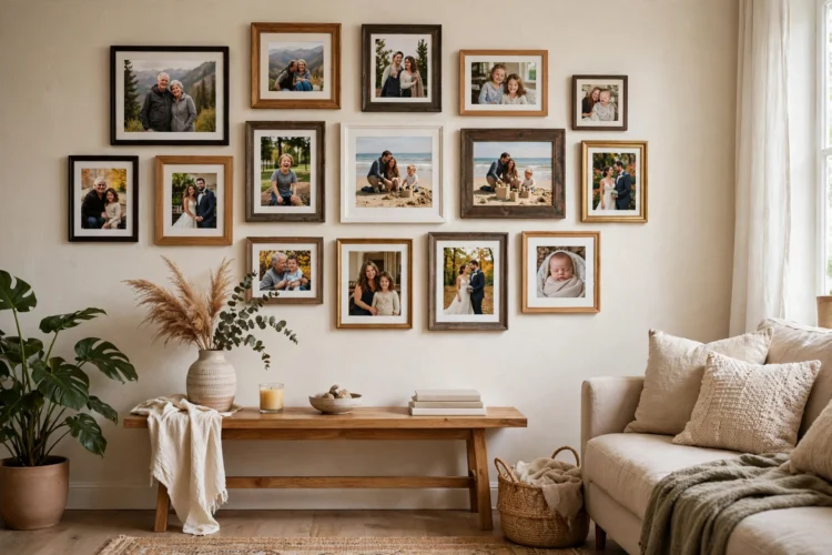
A gallery wall works when it looks collected over time, not bought in one afternoon. These ten ideas cover layout templates, frame mixing, spacing, and the personal pieces that make it yours.
Gallery wall ideas living room projects fail for one predictable reason: people hang pieces one at a time, by eye, and end up with a scatter instead of a composition. A good gallery wall is planned like a piece of furniture, with an anchor, a boundary, and a rhythm. It also needs personal pieces, because a wall of matching store prints looks like a hotel lobby no matter how well it is hung. Plan the layout on the floor, mix frames with discipline, and leave room for the wall to grow.
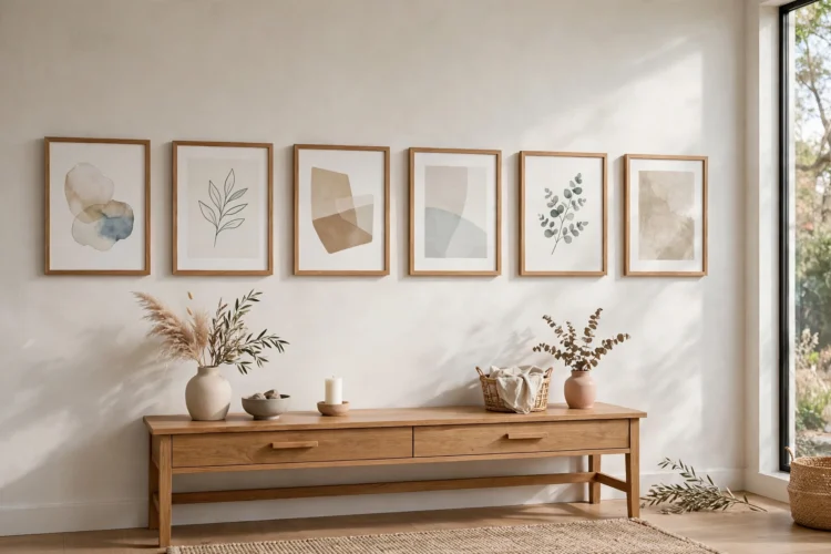
Start from a template instead of improvising on the wall. The grid suits equal-size frames and calm rooms: rows and columns with identical spacing, usually 5 to 8 centimeters between frames. The salon style suits mixed collections: a large anchor piece at center or slightly above center, with smaller pieces filling outward in a loose rectangle. The ledge line hangs one row at eye level and stacks pieces above it loosely, which works above a sofa. The staircase climb follows the angle of the stairs, keeping the center of each frame at the same height above each step. The corridor column stacks frames vertically in a narrow hall or beside a door. Gallery wall layout templates like these remove the guesswork; pick one, then let your pieces adapt to it rather than forcing a shape your collection cannot fill. If your collection is mostly small pieces, choose the salon style and let the anchor be a mirror, since a mirror adds the visual weight a small print cannot.
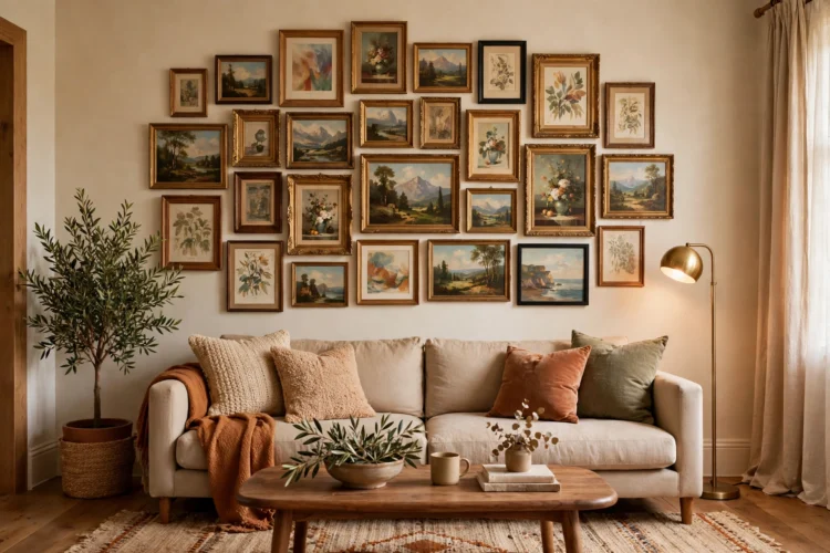
Every gallery wall needs an anchor: the largest or most meaningful piece, hung first, at eye level, roughly 145 centimeters from floor to center. Everything else positions itself relative to that anchor. Without one, pieces drift, because there is no reference point for spacing or height. The anchor does not have to be art; a large mirror, a woven textile, or a framed map works, as long as it is clearly bigger than its neighbors. Hang it, step back to the doorway, and check that it sits well against the sofa or console below it. If the anchor feels lost, the wall is too big for the collection, and you need a larger anchor or a tighter boundary, not more small pieces.
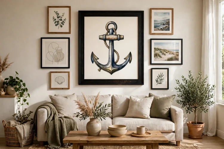
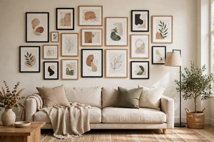
Mixing frame styles looks collected, but only with a rule holding it together. Pick one unifying element and vary the rest: same frame color with different widths, same mat color with different frame materials, or same wood tone with different sizes. Two frame finishes plus one accent, such as black and natural wood with a single gold frame, is a safe ratio. Keep mat widths consistent within each frame size, since uneven mats make pieces look unrelated even in matching frames. Wall treatments set the tone for cohesion too: the way bedroom wall molding frames a wall with architectural lines shows how a consistent background element lets varied pieces sit together calmly. If the wall itself has molding or paneling, let the frames echo its geometry rather than fighting it.
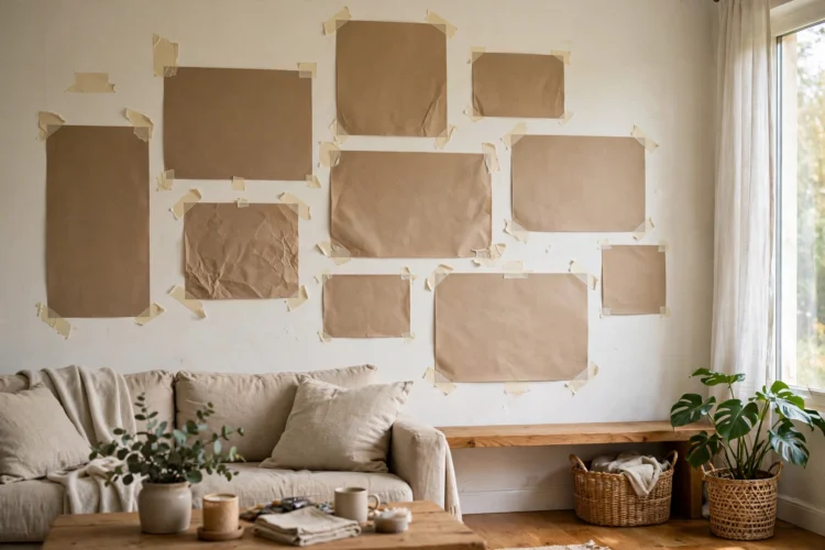
Never hang a gallery wall by holding frames up one at a time. Lay the pieces on the floor in the planned arrangement, then cut paper templates in each frame size and tape them to the wall. Live with the paper version for a day: walk past it, sit on the sofa, and check sightlines from the doorway. This rehearsal catches the two most common errors, a composition that creeps too high and a grouping that leans to one side, before any nail goes in. Mark nail positions on the paper, then hang through the paper and tear it away. The extra hour of planning saves the patch-and-repaint cycle that makes so many gallery walls stall half finished.
Spacing is what separates a gallery wall from a collection of holes in the plaster. Keep gaps consistent, 5 to 8 centimeters for tight, modern groupings and up to 12 centimeters for airy, traditional ones, and use the same gap everywhere in the arrangement. Hanging art at eye level matters more than any other rule: the center of the arrangement should sit near 145 centimeters from the floor, adjusted slightly above a sofa so the bottom frame clears the sofa back by at least 15 centimeters. Measure from the wire or hook, not from the top of the frame, since hanging hardware varies and a two-centimeter error across ten frames compounds into a visibly crooked wall.
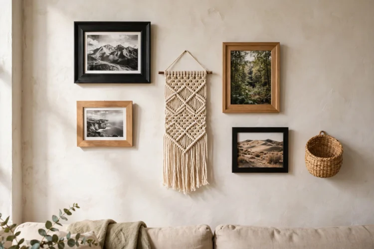
Personal gallery wall pieces are what stop a wall from looking like a catalog page. Mix in a child drawing in a proper frame, a ticket stub mounted on mat board, a small textile, a postcard from a trip, or a handwritten recipe card. One three-dimensional object, such as a small wall basket or a ceramic plaque, breaks the flatness of framed paper and gives the eye a place to rest. Limit personal pieces to about a third of the wall so the composition still reads as art, not a bulletin board. A framed ticket stub or postcard costs almost nothing to mount, yet guests always ask about it first, which is the point of a personal wall. The same template thinking that shapes a small bedroom layout applies here: measure the available wall, assign each piece a zone, and leave breathing room between zones instead of filling every centimeter.
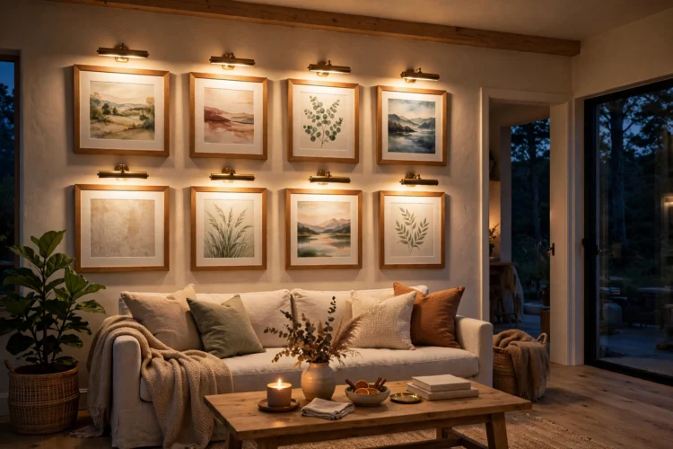
A gallery wall that looks great by day can disappear after dark if the room lighting ignores it. Picture lights mounted above the anchor piece wash the whole group softly, while a directional track head or an adjustable wall washer covers wider arrangements. Warm light, around 2700 Kelvin, keeps paper and photos looking natural; cool light makes them look clinical. If hardwiring is not an option, battery picture lights have improved enough to cover a single anchor piece well, and a nearby floor lamp angled toward the wall does the rest. The layering principles in bedroom lighting ideas apply directly: one light source flattens a wall, while two or three at different heights give it depth after sunset.
A gallery wall is never truly finished, and that is a feature, not a flaw. Hang the planned arrangement, then live with it for two weeks before judging it. Pieces that felt essential on the floor sometimes dominate on the wall, and a gap that looked wrong on paper sometimes reads as breathing room in real life. Swap one piece at a time, not the whole wall, and keep a small box of spare frames so new finds have a home without a shopping trip. Carry the palette into adjoining rooms for continuity: a neutral bedroom nearby, for example, can echo one frame color from the living room wall, which ties the home together without repeating the display. The best gallery walls grow slowly, one meaningful piece at a time.
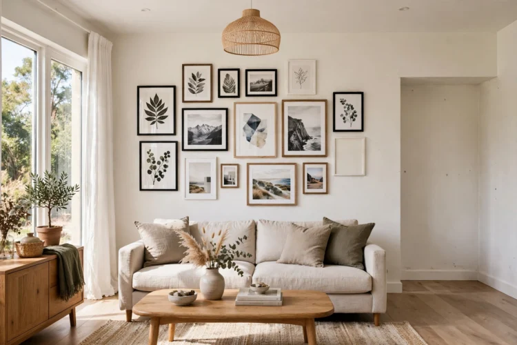
Plan on the floor, hang one anchor first, keep spacing consistent, and let personal pieces in. The wall will look collected because it was collected, not assembled in an afternoon. Leave one empty hook at the edge of the arrangement, so the next meaningful piece has somewhere to go without rearranging the whole wall.