Physical Address
304 North Cardinal St.
Dorchester Center, MA 02124
Physical Address
304 North Cardinal St.
Dorchester Center, MA 02124

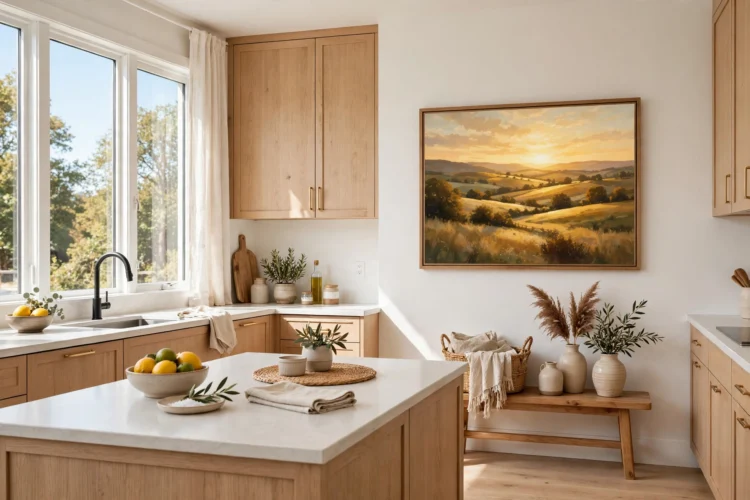
The right piece of art turns a blank kitchen wall into the warmest spot in the room, as long as it hangs clear of steam and grease.
Kitchen walls get ignored. The cabinets take the good space, the backsplash takes the middle, and what is left is a blank stretch above the sideboard or a narrow gap between two cabinets that nobody knows what to do with. Kitchen wall art ideas fix both problems at once. The right piece fills the blank spot, adds color the cabinets cannot, and makes the room feel finished. The only rule that matters is placement: keep art away from the stove and the sink, where grease and steam will ruin it.
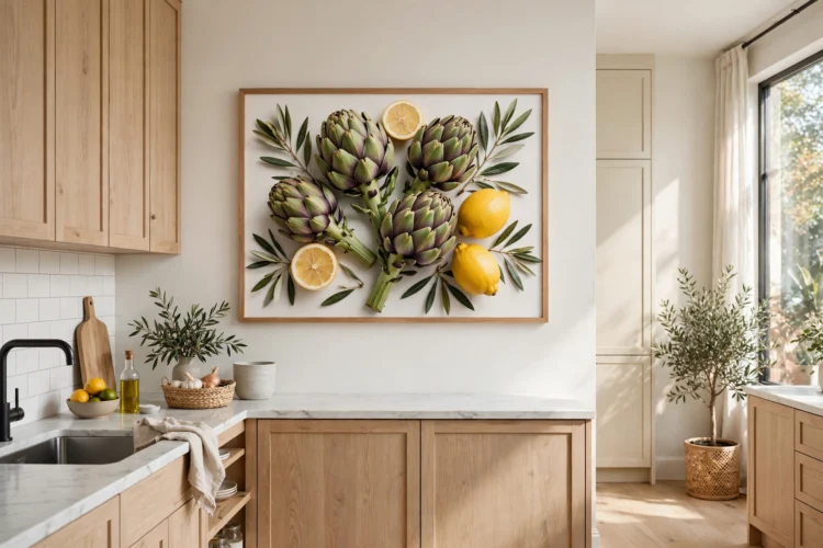
One big print beats five small ones on a blank wall. A print around 30 by 40 inches fills the space above a sideboard or a breakfast table in a single move, and the scale makes the wall feel planned instead of leftover. Food photography works well at this size: a close shot of citrus, herbs, or a market stall brings color without a busy pattern.
Hang the center of the print at eye level, about 57 inches from the floor, and leave at least 6 inches of wall on each side so the frame does not crowd the cabinets. A simple wood or black metal frame keeps the focus on the image, and glass with a matte finish cuts glare from the kitchen lights. If the wall is very wide, a print this size still works: center it over the furniture below and let the empty wall on each side act as breathing room. For a softer look, a canvas print with no frame suits a farmhouse or cottage kitchen, and it weighs less on the wall.
Vintage food posters are classic kitchen wall decor and bring instant character. Old French market prints, Italian pasta ads, and seed catalog art all share the same warm, slightly faded palette, so they look collected even when you buy them all in one afternoon. Print shops sell reproductions for the price of a takeaway dinner, and a plain frame makes them look far more expensive than they are.
Group two or three posters on one wall, or hang a single large one above the coffee station. Keep them away from the stove, since heat and grease yellow old paper fast, even behind glass. If your kitchen leans modern, one vintage poster adds warmth without changing the whole style. If it leans farmhouse, a row of three above a bench or a sideboard feels right at home. Check the print size against the wall before you order: a poster that looks big online can shrink to a postage stamp on a real wall.
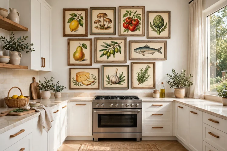
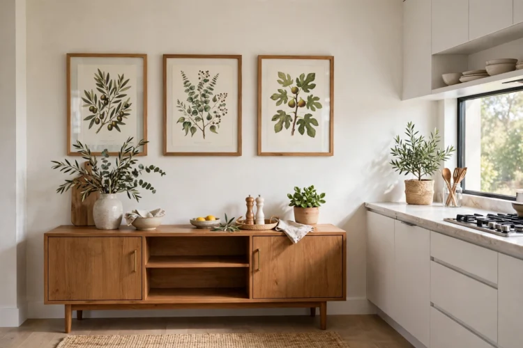
Botanical prints suit kitchens because they echo what happens in the room: herbs, fruit, and green things. A row of framed kitchen prints, such as herb prints, above a sideboard or a coffee bar adds color that changes with the seasons, and the subject never fights with the cabinets. Choose prints with a white or cream background so the wall still reads light.
Hang three prints in a row for a tidy look, or six in a grid for a bigger wall. Keep the frames identical and the spacing even, about 2 inches apart, so the group reads as one piece. If you grow herbs on the windowsill, match the prints to the plants: basil, rosemary, and mint are easy to find and easy to recognize. A botanical print also works in the narrow gap between a tall cabinet and a doorway, where a single vertical print fills the slot without crowding the walkway.
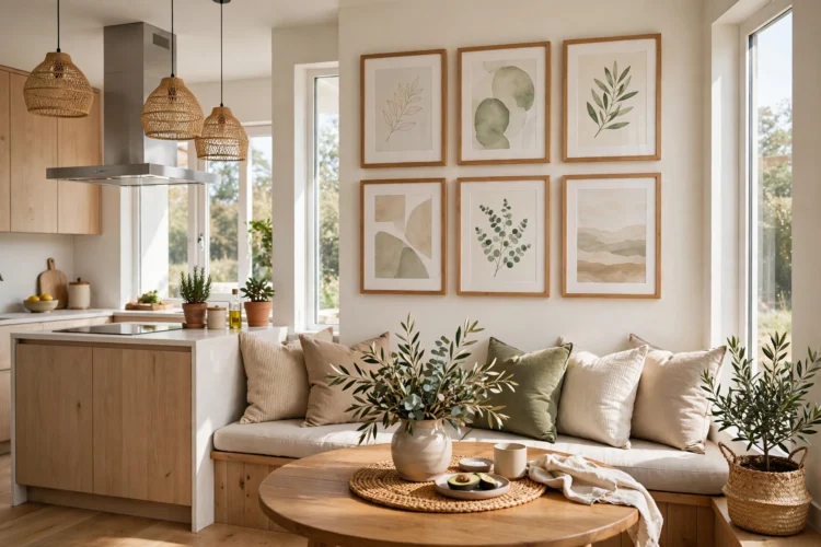
A breakfast nook is the best wall in the kitchen for a kitchen gallery wall, because people sit and look at it. Mix framed prints, a small mirror, and one object like a woven basket or a ceramic plate, and the wall becomes the view while you eat. The mix keeps it from looking like a shop display, and the personal pieces make it yours.
Start with the largest piece in the center, then build outward with smaller frames. Keep about 2 inches between frames and hang the whole group so its center sits at eye level from a seated position, which is lower than standing eye level. A gallery above a bench needs frames with glass or acrylic, since food and elbows get close. If the nook is small, three frames are enough; a big wall can take seven or eight. Lay the arrangement on the floor first and photograph it, so you can hang it once instead of patching holes all afternoon. These gallery wall layout ideas for blank walls work just as well in a kitchen nook as they do in a living room.
Every kitchen has a tall, narrow gap: beside the fridge, between two tall cabinets, or at the end of a run of units. A tall canvas, roughly 20 by 40 inches, fills that gap in one piece. Vertical art suits the space because it matches the shape of the wall instead of fighting it.
Choose a simple subject with a strong vertical line: a tall vase of branches, a stack of bowls, or a landscape with a clear horizon low in the frame. A busy pattern in a narrow space looks cramped, while a calm image makes the gap feel intentional. Hang the canvas so its top sits level with the top of the nearby cabinets, which ties it into the room instead of floating it on a bare wall. If the gap is very narrow, a slim frame with no mat keeps the art from looking squeezed, and a canvas with no frame at all works even better.
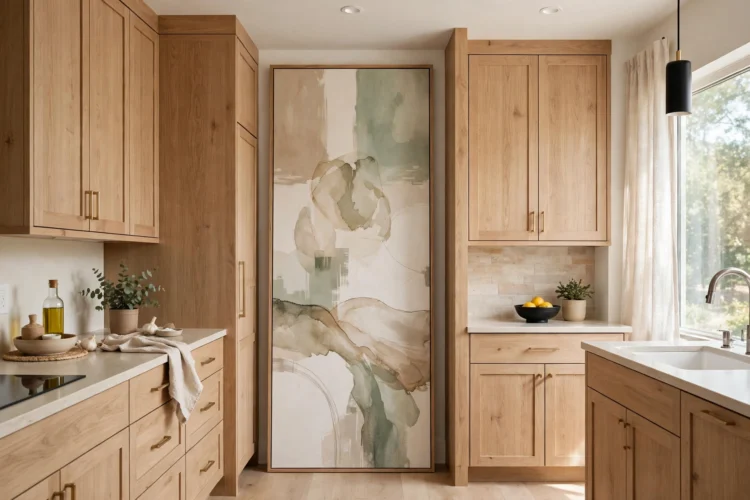
A framed menu board near the kitchen entrance does two jobs: it fills a blank wall and it tells the family what is for dinner. A chalkboard in a wooden frame, or a printed weekly menu in a glass frame, turns a plain wall into a working part of the room. It suits kitchens that open onto a hallway or a dining room, where the board is the first thing you see.
Keep the board at eye level and close to the door, not buried behind the fridge. Chalkboard paint on a framed board lets you rewrite the menu each week, and a small shelf below holds chalk and a cloth. If chalk dust bothers you, a whiteboard in the same frame works just as well and wipes clean in seconds. Add a hook beside the board for a shopping list pad, and the wall becomes the kitchen’s notice board. This is one of the few art pieces that earns its wall space with a daily job.
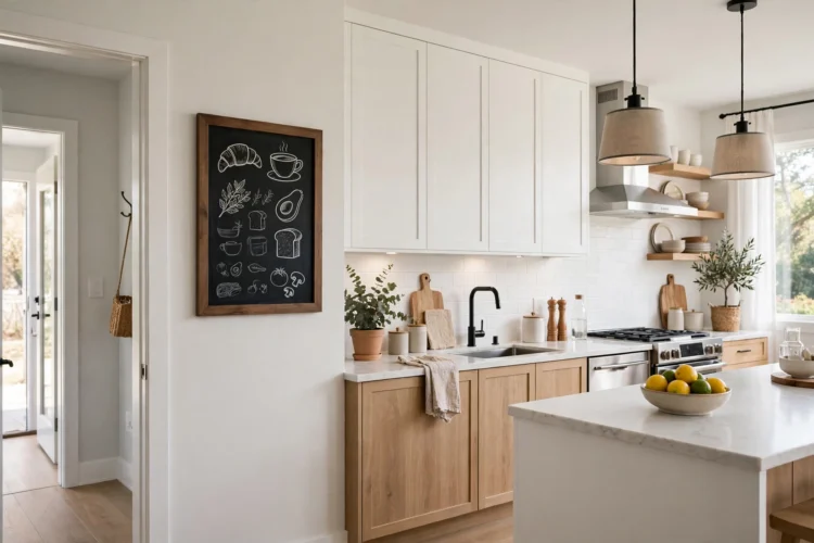
The gap between the top of a wall cabinet and the ceiling, or the strip of wall between two cabinets, is too small for a statement piece and too visible to leave bare. Small prints, about 8 by 10 inches, fill it. A pair of small prints stacked vertically fits a narrow strip, and a row of three fits the strip above a run of cabinets.
Pick prints with a light background and a simple subject, since a small frame cannot carry a busy image. Food illustrations, single herb sprigs, and small landscapes all work. Hang them with the same spacing as the cabinets below so the row lines up with the room. If the gap sits above the stove, skip art there entirely: heat and grease will damage any print, framed or not. The gap above the sink has the same problem with steam. Save the small prints for dry walls, and the art will last for years instead of months.
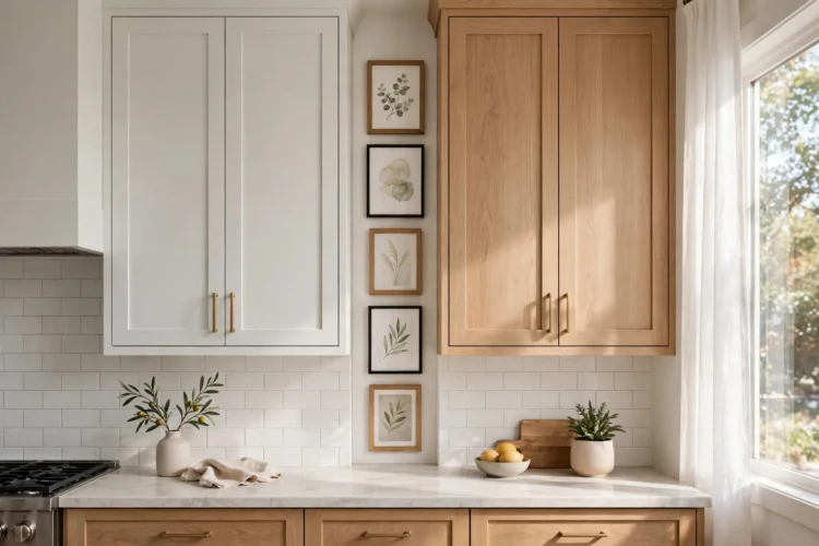
Metal wall art is one of the sturdiest kitchen wall art ideas because it handles kitchen conditions better than paper. A laser-cut metal piece, a hammered copper panel, or a simple steel herb sign can take steam and the odd splash without damage, as long as it hangs away from direct stove heat. Metal adds texture that paper cannot, and a matte black or aged brass finish ties in with faucets and cabinet pulls.
Hang metal art on a dry wall, such as the wall beside the dining table or above a sideboard. Keep it at least 3 feet from the stove and the sink, and wipe it with a dry cloth when you clean the kitchen. A single metal piece works best as a focal point; two or three small ones scattered around the room look like clutter. If your kitchen already mixes metals on the hardware, match the art to the dominant finish so the room reads as one scheme instead of a collection of separate decisions. These kitchen faucet ideas from brass to matte black show how one metal can anchor the whole room.
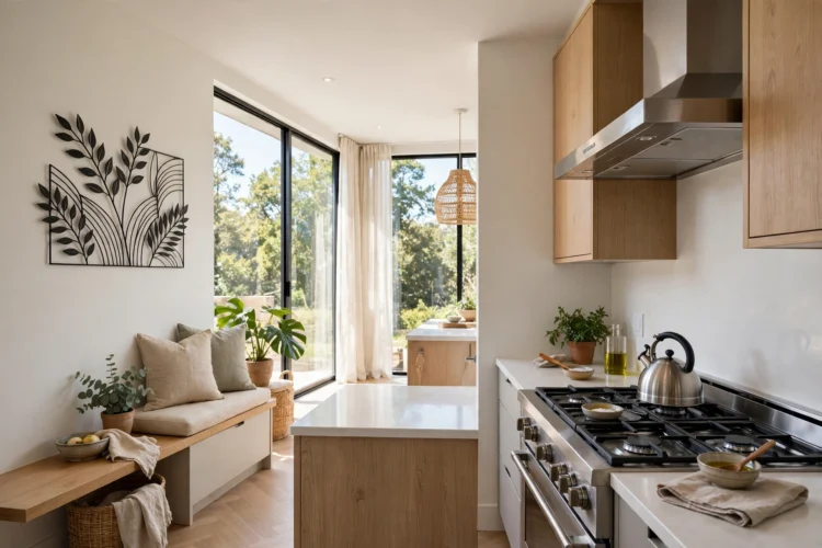
A picture light turns framed art from decoration into a feature. A slim brass or black light mounted above a frame washes the art in warm light and makes the wall glow in the evening, when the kitchen is at its busiest. Battery-powered picture lights need no wiring, which makes them a renter-friendly upgrade.
Mount the light about 6 inches above the frame and angle it down so the light covers the art without spilling onto the ceiling. Warm white light, around 2700K, flatters food prints and botanical art; cool white light makes them look flat. If the art hangs above a sideboard, the picture light doubles as evening lighting for the room, and the sideboard below it becomes a natural spot for a vase or a candle. Skip the picture light on art that hangs near the stove, since the heat will shorten the battery life and the grease will coat the shade.
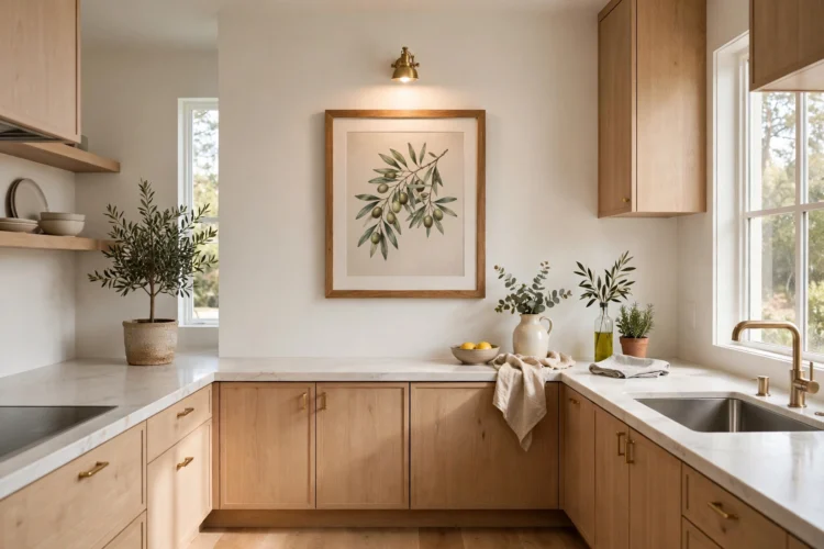
Walk your kitchen and count the blank walls. Most kitchens have two or three, and each one only needs a single decision: one print, one group, one board. These kitchen wall art ideas all share one rule, and kitchen art placement matters more than the art itself: keep it clear of steam and grease. Hang the first piece this weekend and the room will feel finished in an afternoon. For more ideas on filling vertical space, these picture ledge ideas for rotating art displays let you swap art without new holes in the wall.